
June 12, 2025

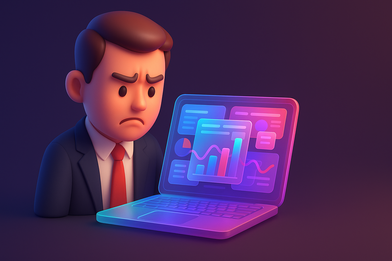
Imagine the image: The purchasing manager of the public company is looking for a software solution worth millions of baht. He was assigned to find basic information from 3-4 leading companies. He opened your website ... But instead had to encounter a technical term that he didn't understand, can't find the case study page, do not know who to contact And the important thing is ... The website doesn't seem to be updated since 5 years ago. He took less than 30 seconds before pressing and turning to a competitor's website that looks reliable and easier to use.
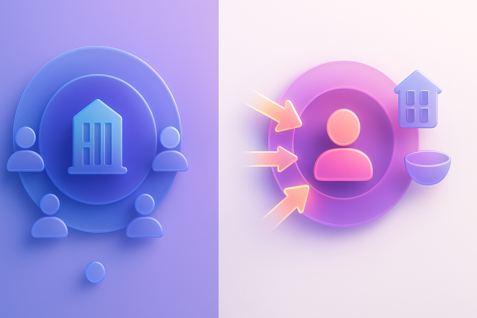
This is a true story that happens every day in the B2B business world. The one -time purchase decision may mean enormous income. Your website is not just "Online brochure" anymore, but it is the "new seller" who works 24 hours and you are leaving this "seller" to chase your most important customers without knowing it?
Many companies invest enormous with SEO, shoot Google, or make a campaign on linkedin to draw people into the web. But overlooked The most important "final checkpoint" is "User Experience (UX)" on their own website. Especially the web for B2B business that is highly complex These problems have occurred repeatedly:
If your website has these symptoms It is no different from sending the seller who does not know about it and doesn't dress neatly to meet important customers.
These errors are not caused by inattentive. But caused by the basic misunderstanding of the B2B website design. Many organizations tend to be trapped in "Old thought trap":
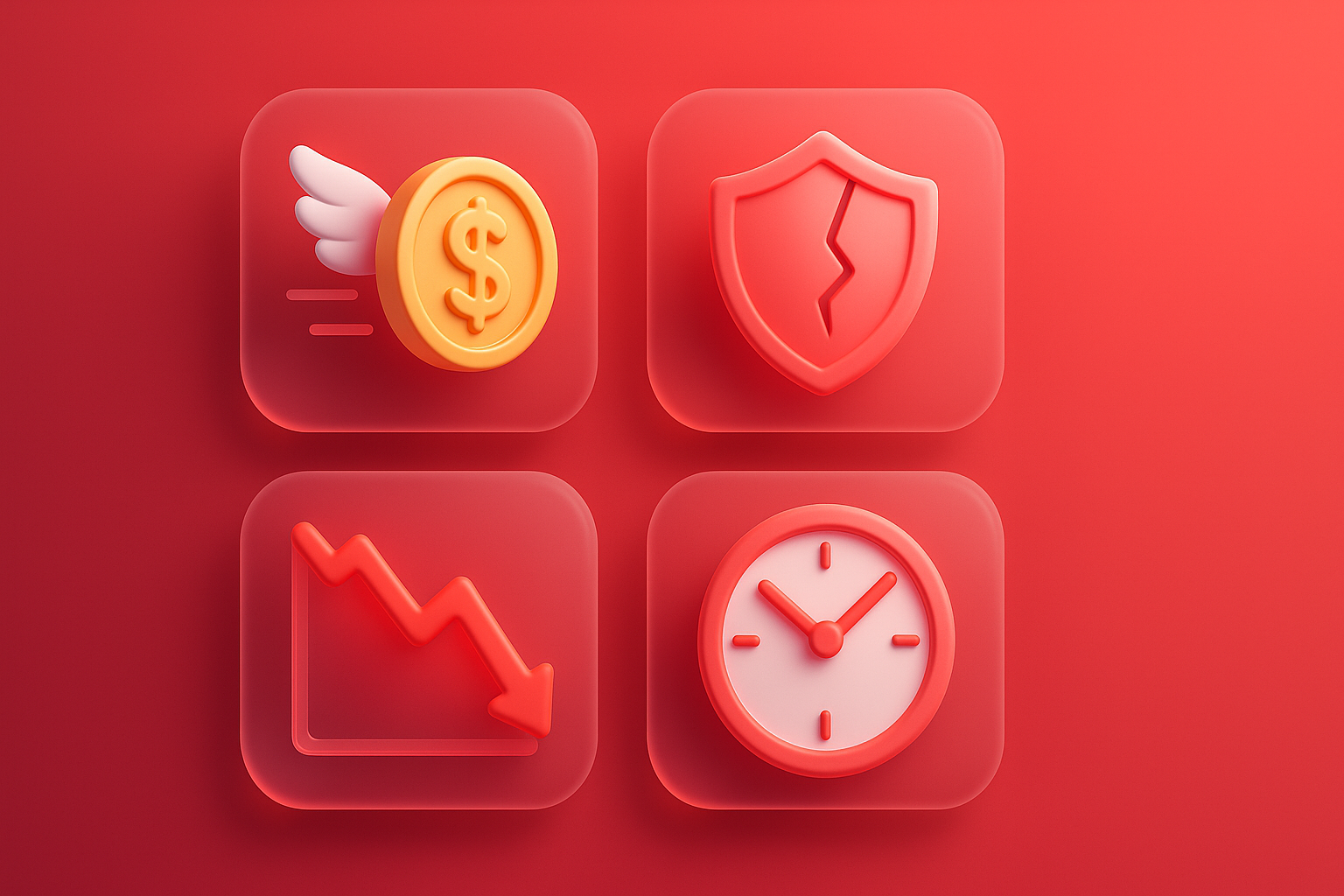
Having a bad UX on the B2B website is not just about "beauty" or "modern" but it directly affects the "numbers" and "growth" of your business.
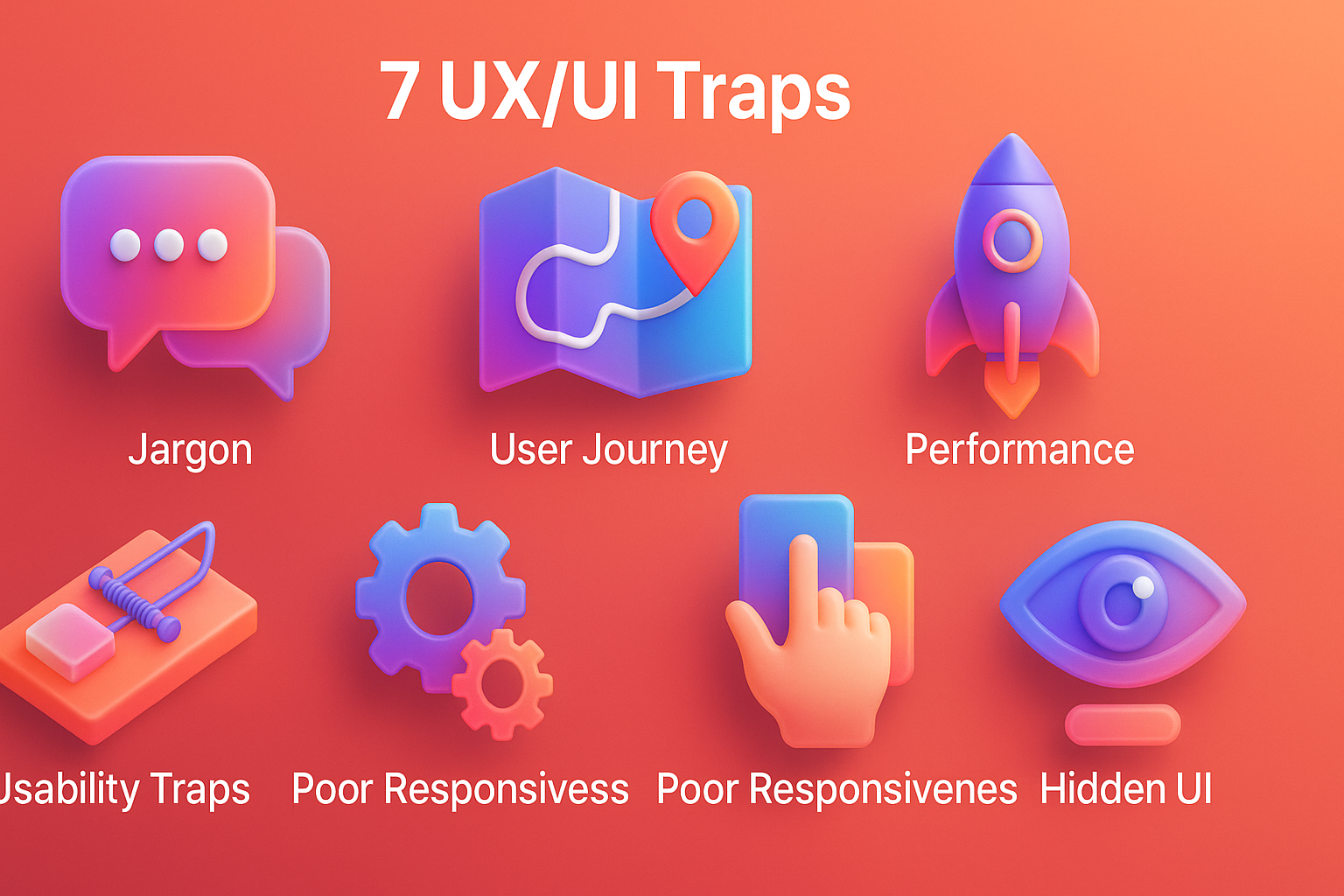
The good news is that these problems can be resolved. Changing your website into excellent customers Must start with "knowing" and "avoiding" the most dangerous trap, these 7 and this is a solution that you can start immediately:
Problems: Use abbreviations, product model names, or technical vocabulary that customers do not know
how to solve: switch to the language that the customer uses Communicate with a "benefit" that customers will receive, not the "feature" that you have, try to ask your sales team. "What does the customer use the word when explaining his problem?" And use those words on the website.
Problems: Make finding the case studies, prices, or contact information are difficult.
Solution: Create navigation menu and easy to understand. Allowing important information to reach within 2-3 clicking UX Analysis will help you to prioritize the data better.
Problems: The website shows well on the computer. But cannot be used on mobile phones.
Solution: Executives and decision -making people often find information via mobile phones while traveling or a short time. Be sure that your website is a complete Responsive Design. Easy keypad, easy to read and fast loading on mobile.
Problems: No reviews, customer logo, or any guaranteed award.
Solution: "Show, don't Tell." Show the logo of the customer that you are proud of, put the testimonials with the name and position of the customer, and present the case study that has a real leaping. This is what B2B UX experts are always emphasized.
Problem: presenting the same information for everyone Despite the customers have many roles.
Solution: Create "clear path" for each group of User Persona, such as having a section for the "technical department" that needs in -depth information and another section for "executives" who want to see the overall picture and Roi.
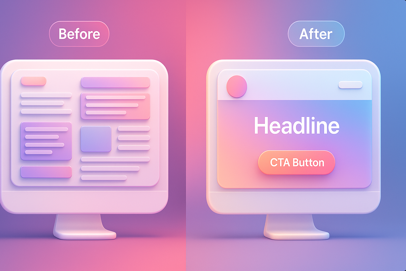
Problem: Use a ambiguous and boring button like "Learn more" or "Send information".
Solution: Make your CTA clear and straightforward. Tell you to know what you click, such as "Request a project quotation", "Make an appointment to see Demo" or "Download WhitePaper". This is the heart of UX/UI that can actually
Problems: Website downloads more than 3-4 seconds.
Solution: Speed is one of the first impression factors and is a signal of professionalism. Compressing images, reducing the use of unnecessary scripts, and choosing high quality hosting The slow loading website is a good business opportunity.
The company "Tech Solution (assumed name)" Cloud service provider for the organization. There was a website full of technical information and specialized vocabulary. Although there is a traffic from SEO, but has very little quality Lead. (Most of them are students or small companies). The Conversion Rate rate is only 0.5%.
The mission of turning: The team has decided to invest in making UX/UI Redsign , starting from doing research and interviewing the target customers.
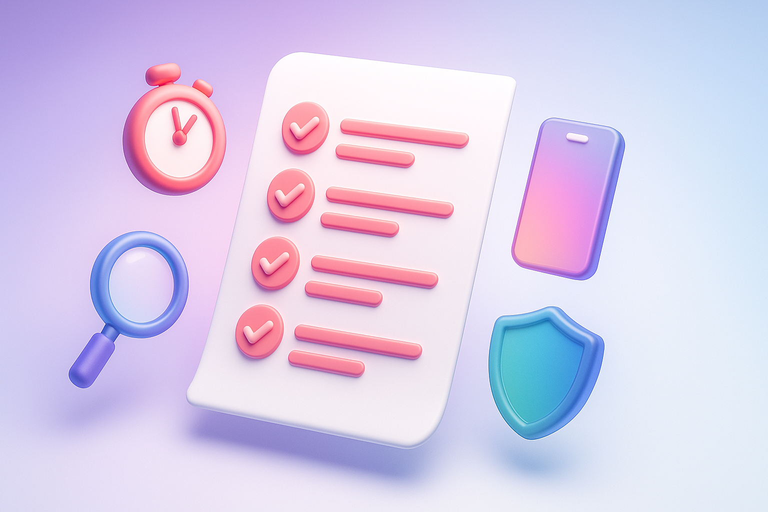
You don't have to redesign all at once. But can start with a small improvement That can be seen immediately. Try to follow this 5 checklist:
To do these small things is the beginning of a great change for Your organization website
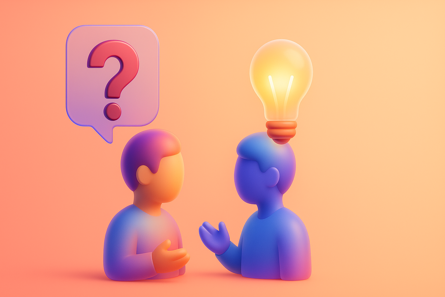
I have compiled a question that is often heard about the UX/UI of the B2B website to answer clearly here.
Q1: B2B website. Just have enough information. No need to be as beautiful as the B2C website, isn't it?
A: True, the information is the heart, but the design that "beautiful" here means "Orderness", "credibility", and "professional". The website that looks old and difficult to use Make your customers feel that your products or services may be old and difficult to use as well. On the other hand, clean and modern design will help strengthen trust immediately.
Q2: We can't put the price on the web because our solution is complicated and different prices. What should I do?
A: You don't need to enter the exact price. But you can give "guidelines" such as "starting price ...", "Popular package", or create a page "Request a detailed quotation" that is easy to use. Providing basic price information helps screening non -target customers. And allowing the sales team to talk to Lead with really potential
Q3: How do you know who our User Persona is? And what does he want?
A: The best source of information is in your own company! Talk to the sales team and the customer service team. They are the people who are in front of the checkpoint and know well what the customers really ask, what are you worried about, and what criteria to make decisions? You can also use tools such as Google Analytics to see the population information and behavior of visitors.
Q4: UX REDESIGN is a big project and uses a lot of budget. Should start small first?
A: Of course! You do not need to remove all again at one time, starting with the "low-hanging fruit" first, such as adjusting the text on the CTA button, making Headline more clear, or adding testimonials. Like we saw in Case study of other businesses That only a little UX improvement can make a difference
Your B2B website is the most powerful marketing and sales tools. It works 24 hours a day and is the first touch where the big customers will get to know you. Letting the website have a bad user experience Is like closing the door in front of the customer worth millions of baht
Avoiding all 7 of the above traps - from the use of language that customers understand, creating reliability, to providing smooth experiences on all devices - is the most important investment that you can do for your business today because in the B2B world. It may mean the growth that change your company forever.
It's time to change your website from just "Online brochure" to become a "large customer production machine" that has never stopped. Are you ready to unlock the true potential of your organization website?
If you are not sure where to start Or need a team of experts to help analyze and "surgery" UX/UI on your website Click here to consult the Vision X Brain team for free. We are ready to help you make the differences that can actually measure.
Before adjusting the UX, people enter the website and then get out. But when removing the new design Become the best off the sale point instead!

After re -the brand with Vision x Brain, sales x3 in 2 months!

Change the web with VISION X Brain for just a few days. New customers start to understand our business immediately.

After the Reemine and Vision X Brain, organizational customers start to book through the website themselves - do not rely on connections like before.

After changing the website with Vision x Brain, the user dares to test the system from the first page - no need to follow the call or explain again.


Add customers to rent with SEO! In -depth, SEO strategy for rental businesses, especially from Local SEO to the product page.

Stop wasting time making a reportable! Teach you how to connect to N8N with Google Looker Studio (Data Studio) to create a Dashboard and automatic marketing.

Make the user "smell" the desired information! Learn the principle of "Information Scent" to design the Navigation and UX that guides users to the goal and add conversion.