
April 18, 2025

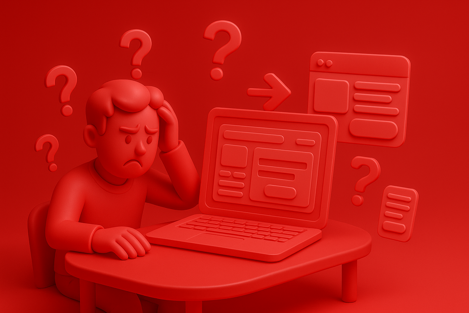
Website designers, business owners, e-commerce, and all digital marketers! Have you ever "head pain" with the problem of this world? ... Our Webflow website is "beautiful." Watching "modern", the feature is "complete", but why ... Why do customers? "Just stop by to greet" and "leave" refusing ". Click the order button" or "fill out the form"? Or worse than that is "Add the item to the basket ... but it disappears!" If you are encountering these problems ... You are not "lonely"! But today I have "good news" to say because "keys" are important to "unlock" this problem and "change" your Webflow website to become "Money Machinery" is hidden in the word "UX/UI designed to conversion"!
In the E-Commerce and Digital Marketing at the "competition" is fierce "more than the drama after the news. "The face of the website (UI - User Interface)" and "Ux -User Experience" is not just a "beautiful thing" anymore, but it is a "secret weapon" that will "point to death" that customers will "love" or "pour" your website! Today I will not teach the boring "theory", but will take you to "in -depth" to "UX/UI techniques on Webflow" model "that" Prove "to help" hypnosis "for customers". Click and then buy "or" Click and contact "." Do not think a lot "! With "real samples" and "tips" that you can use to "use" with your Webflow website "immediately" whether you are a "newbie" or "pro."! If ready ... go "upgrade" your website, "sell well until chat"!
Before we go to "deep down" in each technique I would like us to "adjust the mindset" a little first. Many people talk about "UX/UI", often think of "beauty" of the design, "color" that is perfect, or "animation" that is striking, which is "part", but the most important "heart" of the "excellent" (especially on high -freedom platforms like webflow). It's more "!
UX/UI that "Yes" for "selling" or "create conversion". It must be able to:
"Value Proposition" (clear "and" fast ": Customers have come in and then" Ket "immediately," What will I get from here? "
"Guide the user" to the "goal" that we want "smooth": whether orders, filling in form, or downloading data
"Reduce friction" in every step: making "easy" "" not complicated "and" not frustrating "
"Build Trust" and "confidence": make customers feel "safe" and "want" to do transactions with us.
"Stimulate the decision" (Drive Action) with the Call-to -ction that "Powerful": Inviting to click "can't resist"
If your UX/UI is still "lacking" these elements It is not surprising that sales will not meet the target! Understanding Webflow webpage structure that emphasizes conversion is an important starting point.

And why? Even though the webflow is "free" in this high design But not many websites still have UX/UI that "unfriendly" and "sales" as it should be? From the experience that I have "surgery" for hundreds of webflow websites, I found that "blind spots" or "trap" that are often encountered. There are as follows:
1. "Beautiful design ... but 'messy' until I can't find a way!": Wear Element, Animation, or a lot of colors that "dizzy" do not know what is "important part" or "button to click".
2. "Call-to-to -ction (CTA) 'hidden' or 'unclear': " Order button "or" Contact us "too small, blur the background, or use words that do not" stimulate "to act.
3. "Forms (Forms) Long is a kite tail 'or' difficult to use '": Ask for a lot of information than necessary, filling in small information, or without clear explanations, causing the customers to "discourage" refusing to fill in.
4. "Navigation 'complex like a maze": too much menu, use the technical vocabulary that customers do not understand, or the structure of many layers of the menu until "lost" easily.
5. "Not Mobile-Friendly : Even though it looks like Responsive, but when it actually works on the mobile phone, the button is "not pressing", the letters "too small", or layout "broken" is not beautiful.
6. "Lack of 'Trust Signals'": No customer reviews, no logo, safety certification, or not clear contact information, making customers "not brave" to do transactions.
If your Webflow website has these "symptoms", it means that it's time to "overhaul UX/UI"! And having a UX/UI design team that specializes in creating conversion will help you see the image and solve these problems directly.
"Investment" with the "excellent" UX/UI on your website is not just "losing money" to make the website "look more beautiful", but it is the "investment" that will create a "return" that is worth "and" real business results "in business! Let's see how the UX/UI "yes" can "create differences":
"Conversion Rate Jum!": This is "the main goal"! When the website "is easy to use" "not complicated" and "navigation" to "order" or "contact" smooth ", the rate of change to your customer will" rise "clearly!
"AOV - AOV (AOV) increased!": A good UX/UI can "stimulate" for customers "to buy more" or "choose higher prices"! Such as the design of the "Product Recommendations" system that is smart or "upselling/cross-selling" with art.
"Reducing the Cart Abandonment Rate": If the checkout process "is easy" "short" and "not complicated" the opportunity that customers will "change their minds" in the middle of the way, it will "much less"!
"Customers come back to buy more (Customer Retention)!": Good experience to create "Impression" and "loyalty" to the brand makes customers "want to come back" to buy your products or use your service again.
"Advertising fees (AD SPEND) are more worthwhile!": As your Conversion Rate is higher. This means that you "get customers" from "the same number of advertisements", making ROI from your advertisement "better"!
"The brand image" Watch "Pro" and "more reliable"!: The website that UX/UI is good. It reflects the "care" and "professionalism" of your brand. Understanding Design psychology for conversion will help you create these results.

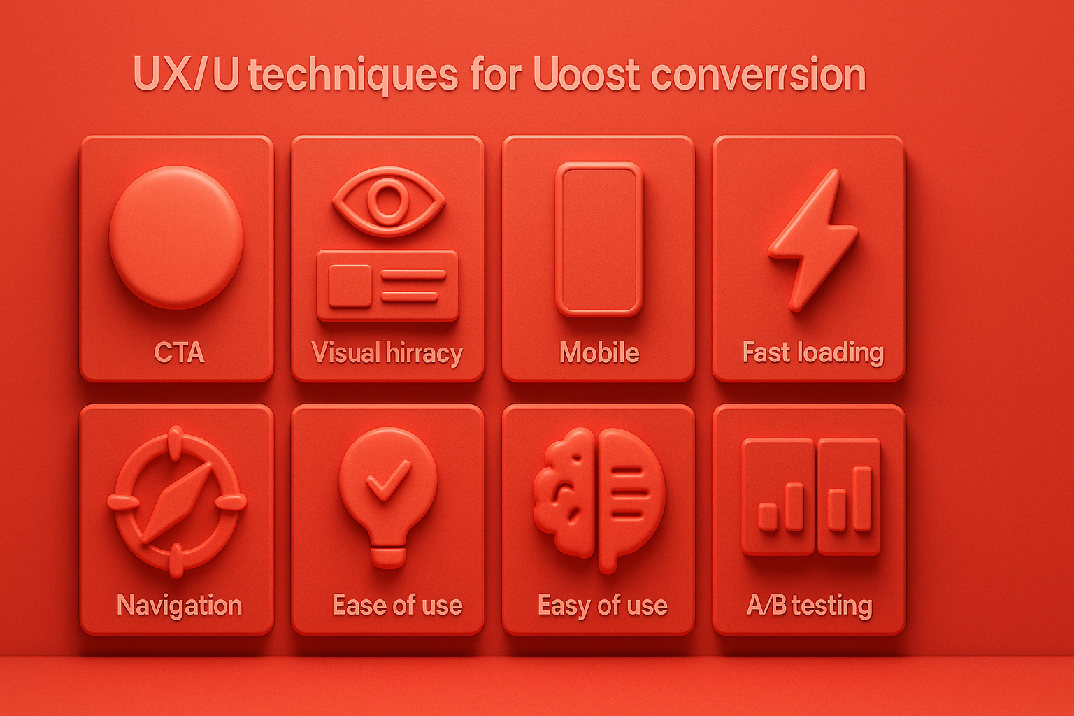
Okay! It's time to "go down" to "subjects" in the design of UX/UI on Webflow that will help "change". Ordinary visitors into your "avid customers"! I have selected "7 important techniques" that "proven" to help "add conversion rate" like "amazing" for you. Try to "apply" to your website website! And of course having The expert team in the design and development of the Webflow website will help the use of these techniques to be done smoothly and efficiently.
Why do you have to do: The first part that the customer sees (Without scrolling) is "golden opportunity" in "attracting" your interests and "communication value"! If this part is "not bang", the customer then "close" immediately!
Webflow techniques:
Headline (H1) at "sharp" and "clear": tell who you are? What can you help? And for who? Use Webflow to manage Typography freely.
Sub-Headline that "expand" and "create curiosity": Explain the main benefits. Or the problem that you can help solve
Hero Image/Video that "Mood Media" and "high quality": use images or video that "reflects" brands and "attracting" webflow eyes, supporting Video Background or Lottie Animations beautifully.
"The main call-to -ction button (CTA)" that "is the most outstanding" and "should click": Use the color that contrasts with the background. Clear text (such as "start free trial", "See all products", "Request a quotation") and place in a position "The easiest to see" Webflow gives you a full button style.
Why do you have to do: The priorities of various elements on the web page will help "navigate" the customer's eyes to the "data" or "button" that you want him to be especially interested in.
Webflow techniques:
Use the "size" (size) and "weight" of the letters: the main topic (H1) must be larger and the most prominent is H2, H3, respectively. The general content uses the size that is easy to read. Webflow manages this very well.
"Color" (color) and "Contrast): use the" outstanding "color for important components (such as CTA buttons) and to have sufficient Contrast between the letters and the background to make it easy to read.
"Gap" (White Space or Negative Space): Do not "compress" everything comes into the web page until "tight"! Having a suitable gap will help each part of the "breath" and "look comfortable" up. Webflow Grid and Flexbox help manage this.
"Group" (Grouping) Related information: Use dividing lines, Card Design, or Background Color to "organize" related information together, making "orderly" and "easy to understand"
Why do you have to do: CTA is the "bridge" that will lead the customer to the "action" that you want! If the "not strong" bridge or "can't see" the customer "does not skip"!
Webflow techniques:
"Design" button to "outstanding": use the color that "cut" with the background color of the website, the size is "large enough" to notice easily, and may have a little "shadow" (Box Shadow) or "Hover effect" to increase the interest in Webflow Interaction.
"Copy" on the button must be "clear" and "stimulate": Tell to know what clicks will "get" or "what happens", such as "get a discount immediately!", "Start free trial 14 days", "Download your e-book here" not just "click here" or "Send".
"Position" CTA must "correct at the right time": There should be a clear CTA from ABOVE THE FOLD and CTA is scattered in the "reasonable" throughout the face, such as after each section or near important information.
"Test" (A/B Test) Your CTA button: Try changing the color, text, or position, then see what kind of conversion rate is best. A/B Testing UX/UI on the webflow will help you get accurate information.
Why do you have to do: form is "door" to collect customer data or contact! If the door "is difficult to open" or "scary", customers "do not want to enter"!
Webflow techniques:
"The shortest as necessary": Request specific information "Really necessary" only. Anything that is not necessary is "cut out", especially in the first form that customers have to fill out.
"Multi-Step Form". If the form is very long: help reduce the "overwhelming" and make it easier to see "Webflow. There are many ways to create multi-form.
"Label" and "Placeholder" must be "clear": tell what each channel must be fill out and may have "samples" to fill out as well.
"Error Messages" that "is friendly" and "help to fix": If the customer fills the wrong Must clearly tell where the wrong And how to fix Not just saying "Error"
"Design" to look at: Use the right space, the font size that is easy to read, and may have Progress Bar for Multi-Step Form.
Why do you have to do: Customers "don't believe" advertisements from a simple brand! But he "believe" advice from "others" or "evidence" that is more tangible!
Webflow techniques:
Show "Testimonials" or "customer reviews" outstanding: may use Webflow CMS to manage and display the reviews beautifully. With pictures and customer names (If permission)
Enter the "customer logo" or "partner" that is famous: helps to increase "reliability" immediately.
Show "numbers" interesting: such as "more than 10,000 customers trust", "Cheap Review Score 4.8/5 Stars", or "help customers save cost x%"
Use the "Trust Badges" or "Security Seals": such as SSL symbol, safe Payment Gateway logo, or certification from reliable agencies.
Show the "Case Studies" or "Success Stories" that "is touched": tell the story that your product or service helps customers. How do you succeed "?
Why do you have to do: most customers "surf the web" and "buy" through "mobile"! If your website "can't watch" or "not working" on your mobile phone, it's equal to you. "Throw customers away" hundreds of thousands of people a day!
Webflow techniques:
"Design", starting with the "mobile screen" always first (Mobile-First Approach): and then gradually expand to the bigger screen. Webflow Designer allows you to present and adjust each Breakpoint in detail.
"Button" and "Element that must click" must "be big enough" for fingers: and have the right distance. Not too close
"Font" must "easy to read" on a small screen: and have a good Contrast with the background.
"Image" must "adjust the size" to suit the mobile screen: and do not slow down the web. Webflow has an optimize tool.
"Test" the actual use on "Mobile devices in a variety of models": Do not just look via Preview on the computer! Paying attention to Mobile-First UX/UI on Webflow for Conversion is an indispensable thing.
Why do you have to do: "Every second" on the web loads slower, meaning "Conversion Rate" that "decreased" and "Bounce Rate" that "increased"! The speed is "everything" in the online world!
Webflow techniques:
"Optimize" all images: compress files (compress), select the right Format (such as WebP), and use "Lazy Lading" Webflow. There is a tool to help in this section.
"Minify HTML, CSS, and JavaScript": Webflow has options to do this automatically when publish.
"Limit the use of the Custom Code" or "SCRIPT" that is not necessary: because it may make the website heavy and slow download.
"Using the" powerful "Webflow Hosting": which uses the world CDN (Content Delivery Network), Fastly and AWS help the web download quickly from everywhere.
"Check" Pagespeed Score with Google Pagespeed Insights on a regular basis: and "update" as a regularly advice.
In order to clearly see the "care" with the UX/UI on the webflow. It really "creates a difference". I would like to give an example. "Specialty coffee shop online" that used to have a website "Beautiful, but the picture ... kissing, not fragrant" but after "overhaul the" UX/UI, all the results are "very remarkable"!
"Yesterday ... that customers just stop by to see": their original website "beautiful design". Use a beautiful coffee picture, but ... "Order" is small "and" coloring color "with the background, the product information is "Scattered" difficult to read, plus the checkout process is "many steps" until most of the customers' headache. "Come and see and leave" or "Leave the gift to the basket." Conversion rate is only 1.2%!
"Mission ... Turn the website for 'Click and buy'! ": The owner of the shop decided" Invest "with the new UX/UI Audit and Redsign on Webflow, focusing on" Conversion-Centered Design ".
Before adjusting the UX, people enter the website and then get out. But when removing the new design Become the best off the sale point instead!

After re -the brand with Vision x Brain, sales x3 in 2 months!

Change the web with VISION X Brain for just a few days. New customers start to understand our business immediately.

After the Reemine and Vision X Brain, organizational customers start to book through the website themselves - do not rely on connections like before.

After changing the website with Vision x Brain, the user dares to test the system from the first page - no need to follow the call or explain again.


Add customers to rent with SEO! In -depth, SEO strategy for rental businesses, especially from Local SEO to the product page.

Stop wasting time making a reportable! Teach you how to connect to N8N with Google Looker Studio (Data Studio) to create a Dashboard and automatic marketing.

Make the user "smell" the desired information! Learn the principle of "Information Scent" to design the Navigation and UX that guides users to the goal and add conversion.