
June 29, 2025
Have you ever felt like this? You dedicated both the budget and time to create a B2B website that looks good. Arrange the product information or service completely, do SEO until the first page has a website every day ... but in the end, what comes back is "silence", no one contacted even one or for a long time, but it is a quality Lead.
You may start wondering where to miss? Is the content not good enough? Or the target audience is incorrect? But often "dead" that many people overlook It is hidden in a small button. You are very familiar with ... The button that says "Contact us" (Contact US) . This is a classic problem that causes many B2B businesses to lose the opportunity to create a unfortunately quality Lead.
[Prompt for illustrations] Pictures of executives or marketing teams sitting in the computer screen with a serious expression on the screen is a Dashboard Analytics with a traffic graph, but the conversion or Lead numbers are zero, with a 'contact' button that looks lonely and has a corner of the web.
This problem is not because the "contact us" button is not good, but it is caused by us. "Submitting the wrong time". Imagine the B2B customers just entered your website for the first time. It's like we just met at a seminar. Then you walk to file a business card to him ... that is normal But if you walk in and say "Marry me!" ... That's a shocking thing.
The button "Contact us" or "Request a quotation" for customers who are still in the beginning of finding information. (Awareness/Consideration Stage) It feels like "proposing to marry". It is a demitment that is too high. He doesn't know you well enough. Still not sure if you can solve the problem for him. Pressing the button means to "Prepare to talk to the sales", which is something that many people want to avoid if it's not really ready.
Therefore, instead of getting the contact information that the customer Instead, you created an invisible wall, pushing him out without knowing it. This is the main reason that traditional CTA B2B Understanding The user experience design for B2B business is therefore very important.
[Prompt for illustrations] Comparison images on both sides of the left side are a picture of a person who submitted a ring to the stranger who just met. And the other party made a frightened surprise The right side is a picture of two people being exchanged for business cards in a friendly way. There is a message that "'Contact us' is like proposal" and "'Download E-Book' like introduction"
Letting your B2B website only have CTA that demands high Commitment like "contact us" only. It is more bad than just not Lead, but it is to destroy business opportunities in the long run:
Letting this problem continue It's no different from your beautiful storefront. But instead locked the door and told the customer to knock only In the online world where everyone has many options ... no one will definitely knock on your door.
[Prompt for illustrations] Pictures of water pipes with large silver leak holes (in the form of coins or bank notes) are flowing out of that leak. The water pipe has a sign on "Marketing Budget" and the destination of the pipe is a website that has only "contact us" buttons that no one presss.
The most powerful solution is to change the new way of thinking from "request" to "Value-First CTA. We have to design. Call-to -ction In accordance with the customer's journey (Buyer's Journey) instead of only one button for everyone.
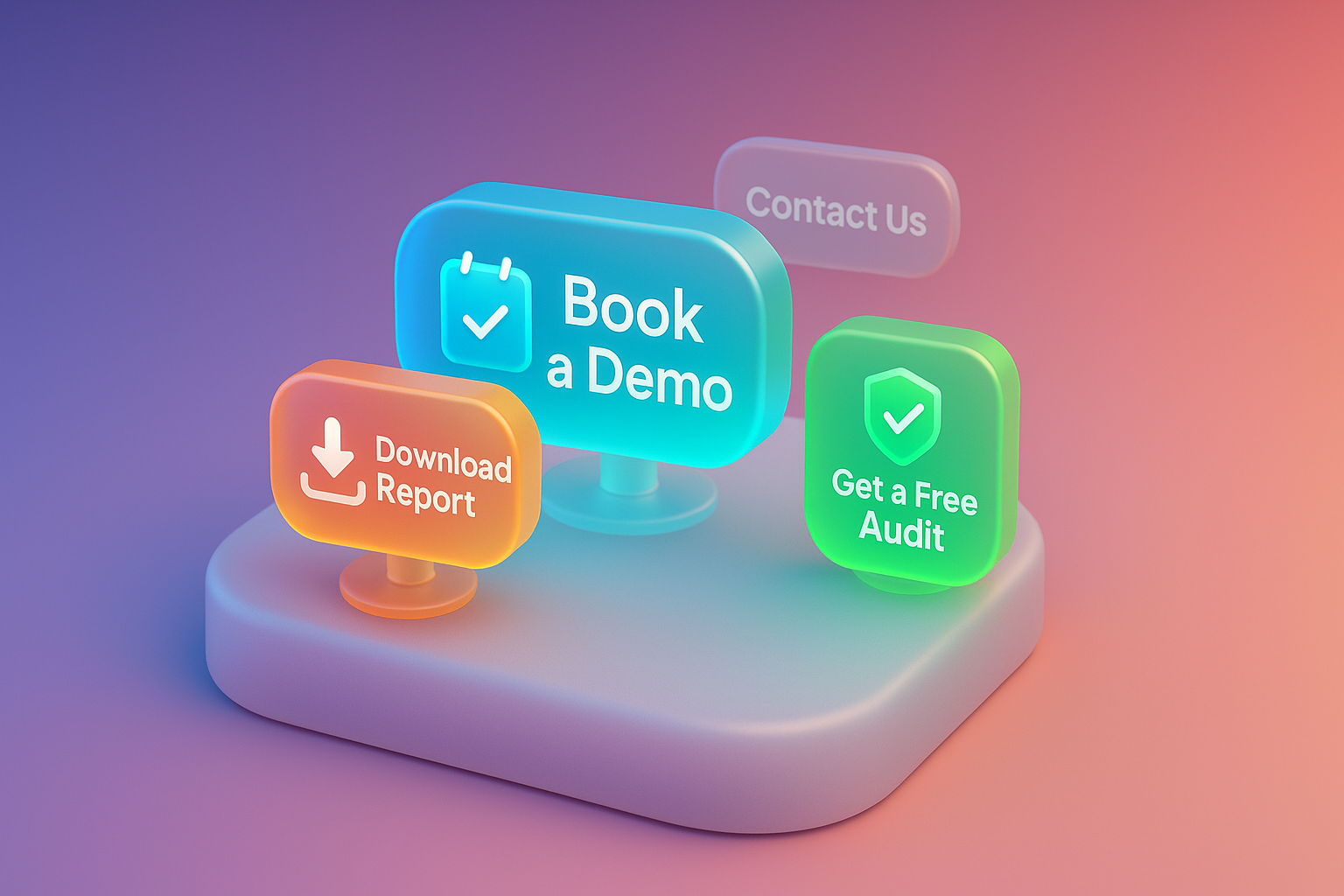
The simple principle is "The less customers know us. We have to ask for less information. And only give him value. "Try to divide your CTA into 3 levels as follows.
Level 1: Top of Funnel - Tofu).
This group just knew you. Not ready to buy Just ask for email. In exchange for useful information
Level 2: Middle of Funnel - MOFU).
This group is already interested in your solution. Need insights to compare
Level 3: Bottom of Funnel (BOFU).
This group is ready to talk to you. This is the right rhythm for CTA with high Commitment.
Having these diverse CTA Will allow you to "trap" Lead at all times of travel For more ideas a reliable information source like Hubspot or Copyblogger
[Prompt for illustrations] Infigue images, cone -shaped cone, which are divided into 3 clear parts (TOP, MIDDLE, Bottom). Each part has different CTA buttons as specified in the content. Makes it clear to see the customer's journey
In order to be clearer I would like to give an example of the case of "Leadgenify" (assumed name). Marketing Automation software company that had encountered a serious problem before. Their websites have tens of thousands of traffic per month, but only Lead from the "Request A Demo" button is less than 20 people per month.
Problems encountered: The only CTA website is "Request A Demo", which is a proposal for customers during the Bottom of Funnel only, causing them to miss a group of people who are still in the study period.
How to solve the problem: Leadgenify's marketing team decided to overhaul all the CTA on the website based on the principle of Buyer's Journey.
Amazing results: within 3 months after changing all CTA ledgenify strategies can increase the number of Marketing Qualified Leads (MQLS) from an average of 20 months to 84 people per month or an increase of more than 320% , with the same marketing budget! This is the power of the proposal that is "correct at the right time and the right person" and is one of the successful CTA B2B samples.
[Prompt for illustration] 2 graph images compared to the first line (gray), written "before adjusting the CTA" with a low level number, the second line (bright green), written "after adjusting CTA" showing the growth growth. With the percent number, "+320% MQLS"
Read here You probably want to go back to overhaul your own website, right? Try to follow this 5 checklist. Ensure that you will be able to create CTA B2B CTA B2B.
Just follow this 5 steps, you will be able to change the website that used to be lonely. Into a tool for customers working for you 24 hours a day
[Prompt for illustration] Checklist images with 5 items according to the content. Each item has beautiful icons, easy to understand, such as item 1 as a map, item 2 is a gift box, Article 3 is a pencil shape, Article 4 is a shaped paint, item 5 is the target arrow.
I have compiled a common question about CTA B2B to answer. I wonder here.
Q1: Should we take the "Contact US" button?
A: No need to remove it. But should reduce the importance May move to the top or final menu of the website (Header/Footer) and focus on the cta mainly more attractive on each page instead.
Q2: How many CTAs?
A: There should be the only "CTA" (Primary CTA) that is the most outstanding. In order not to confuse the user, but there may be "Secondary Cta" which is an alternative. For example, PRICING may have the main button is "Start Free Trial" (bright green) and has a "Talk to Sales" (the letter has southern lines). For those who do not want to try but want to talk.
Q3: What should the CTA button be?
A: There is no color, the best. The rules are more important than the color is The "Contrast", your button must have a distinctive color from the background color of the website clearly. For users to notice immediately
Q4: How do you know that our CTA works?
A: Must measure the results! Use tools such as Google Analytics or Hotjar to follow the Click-Through Rate (CTR) and conversion rate of each button and should do A/B Testing to test various CTA (such as changing text, color change) to find the best version.
[Prompt for illustration] The image of the light bulb icon is above the question mark (?) In the middle and there are 4 small icons surrounded by each question (such as the Contact US button, the webpage with many buttons, images, graphs, results) to convey the solution.
At this point, I believe that you can only see that sticking to the "contact us" button only. How much does it limit the potential of your B2B website? The heart of creating successful CTA B2B Is to change the view from "Try to sell" as "try to help"
Always give value to your persons first ... give knowledge, tools, give cases, study, basic advice And when they feel that you are "Expert" who truly understands his problems The decision to press the "Demo" button or "talk to the sales department" will become easy for them immediately.
Don't let your website be just a beautiful online brochure. But turn it into a "consultant" and "the most powerful relationship" tool.
It's time to change every traffic into an optionality! If you want an expert advisor to design and create a powerful LANDING Page with a powerful CTA and create a conversion for your B2B business.
Click here to see the Landing Page design service that creates high conversion or consult our Conversion Rate Optimization expert! We are ready to help you change the "visitors" to "customers".
[Prompt for illustration] Second hand images One side is "submitting" a beautiful gift box (instead of Value) to the other side that is about to "receive" willingly to convey the concept of "before accepting" is a picture that gives a positive and inspiring feeling.
Before adjusting the UX, people enter the website and then get out. But when removing the new design Become the best off the sale point instead!

After re -the brand with Vision x Brain, sales x3 in 2 months!

Change the web with VISION X Brain for just a few days. New customers start to understand our business immediately.

After the Reemine and Vision X Brain, organizational customers start to book through the website themselves - do not rely on connections like before.

After changing the website with Vision x Brain, the user dares to test the system from the first page - no need to follow the call or explain again.


Add customers to rent with SEO! In -depth, SEO strategy for rental businesses, especially from Local SEO to the product page.

Stop wasting time making a reportable! Teach you how to connect to N8N with Google Looker Studio (Data Studio) to create a Dashboard and automatic marketing.

Make the user "smell" the desired information! Learn the principle of "Information Scent" to design the Navigation and UX that guides users to the goal and add conversion.