
June 13, 2025

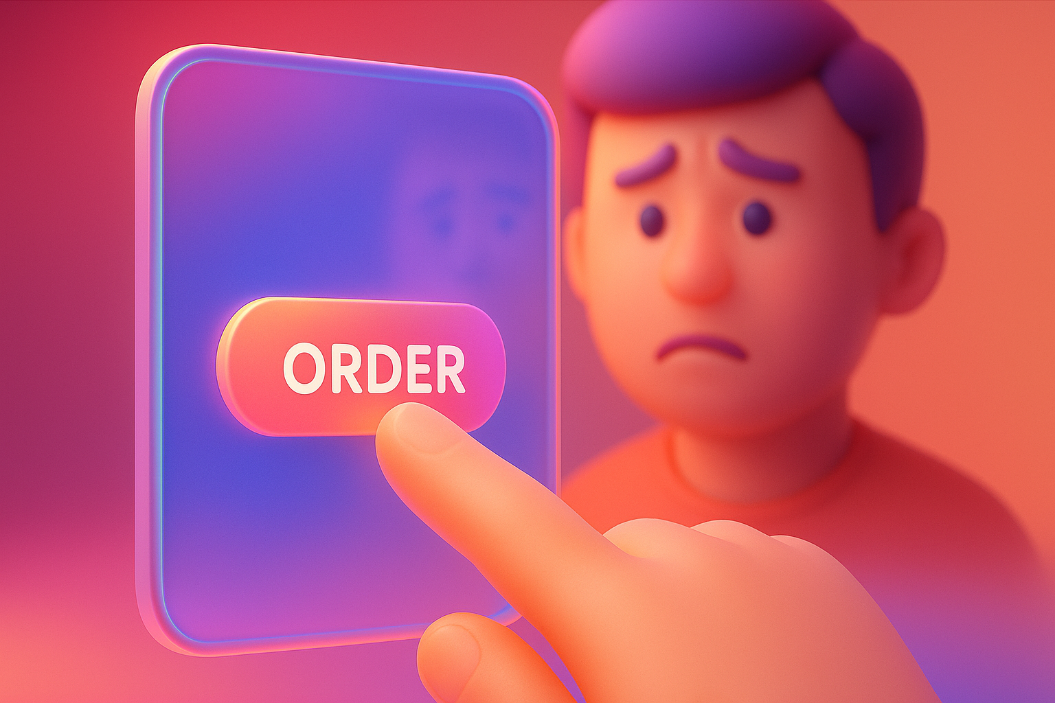
Have you ever felt like this? You are going to press the button. "Confirmation confirmation" the most important on the website. But once pressed ... everything is "completely quiet". Nothing happened. The screen does not move. No notification message Your heart starts dizzy. "Eh ... have I pressed it yet?" "Will the money be duplicated?" Or when filling out the form. Inadvertently a little wrong Nothing hints which channels that have been missed Realizing again, the information is completely gone! These feelings of frustration, confusion and uncertainty. Is the problem that users actually encounter every day on the website that feels like "dead" or "not lively" and it is an important factor that makes good customers Of you turn back and walk away quietly
This problem arises because most web people (Both designers and programmers) tend to focus on "big images". For example, the webpage structure must be beautiful, the main feature must work, the color of the brand must be correct. All of which are very important But they tend to overlook "Small details" on the way, they think that the color change button when pressing or having a small animation when loading the data is just a "decoration" that is not necessary and wasting time to do. But in reality These details are not just beautiful things. It is the "body language" of the website that uses directly to users. The "quiet" website is like we talk to people who do not nod in response, do not make eye contact or without any reactions. Finally, we don't know if he is listening to us or not. And that is the reason why many websites lack charm and create awkward experience without knowing
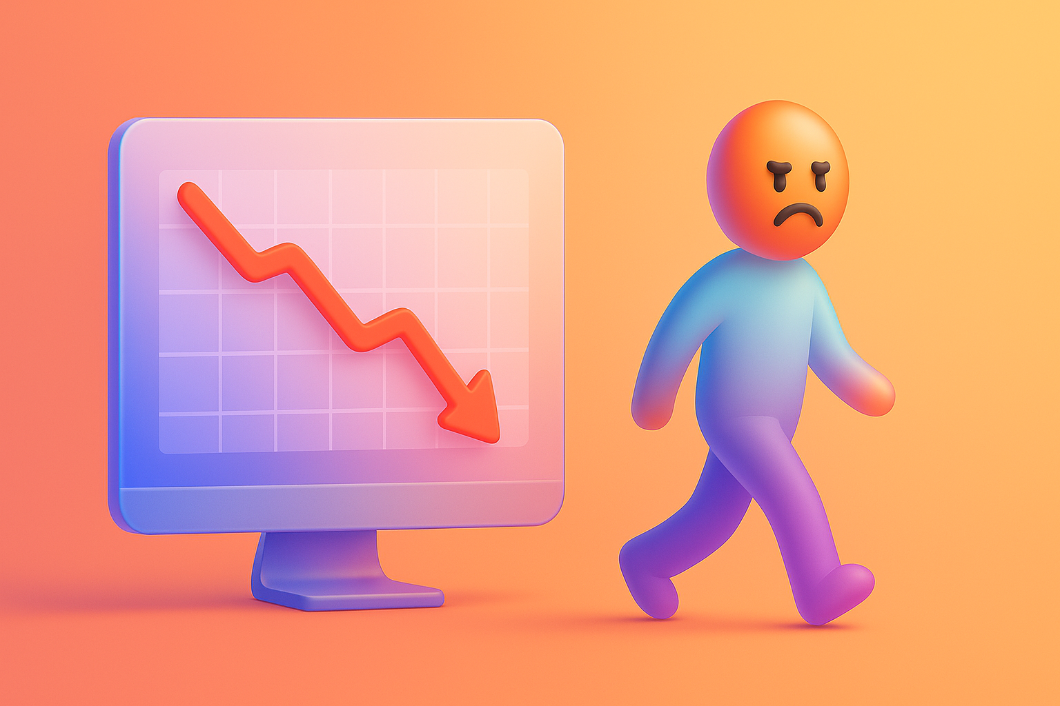
Having a website that "Can't communicate", more serious than you think. It's not just a matter of beauty. But directly affects your business Imagine:
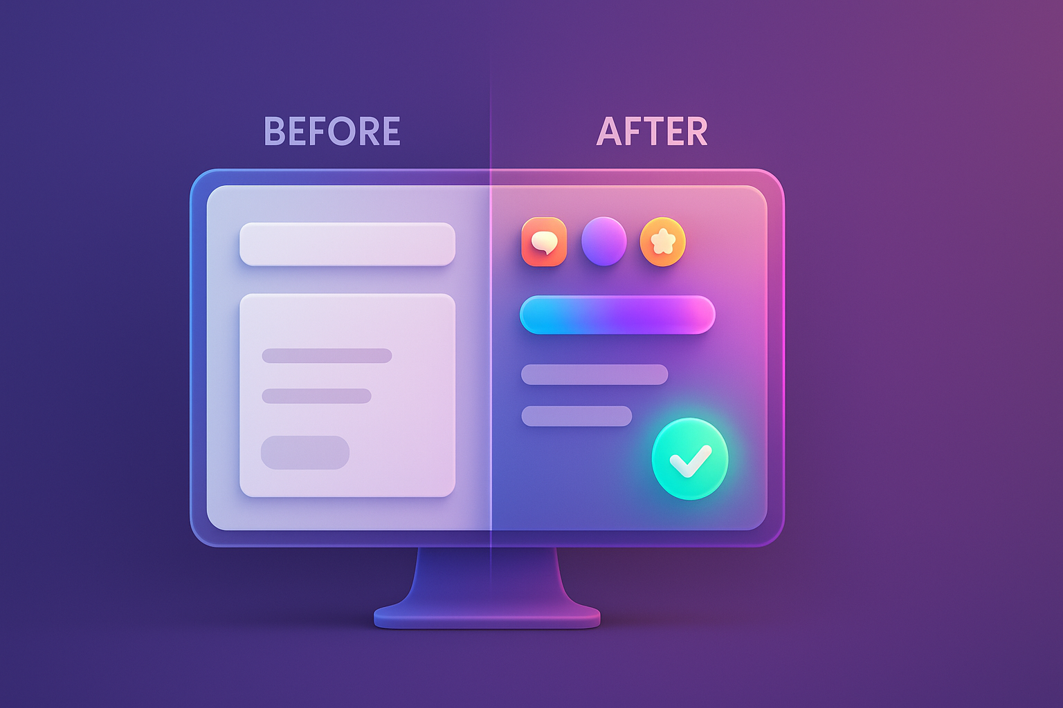
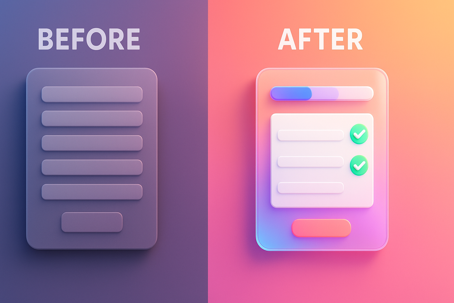
All this solution is called "Micro-International" (Micro-Interction) . Speaking the easiest, it is "The small details or reactions that occur when the user does something on the website" to let users know that "I already know what you are doing." And "This is the result." It was a website that used to "be quiet" into a smart conversation partner.
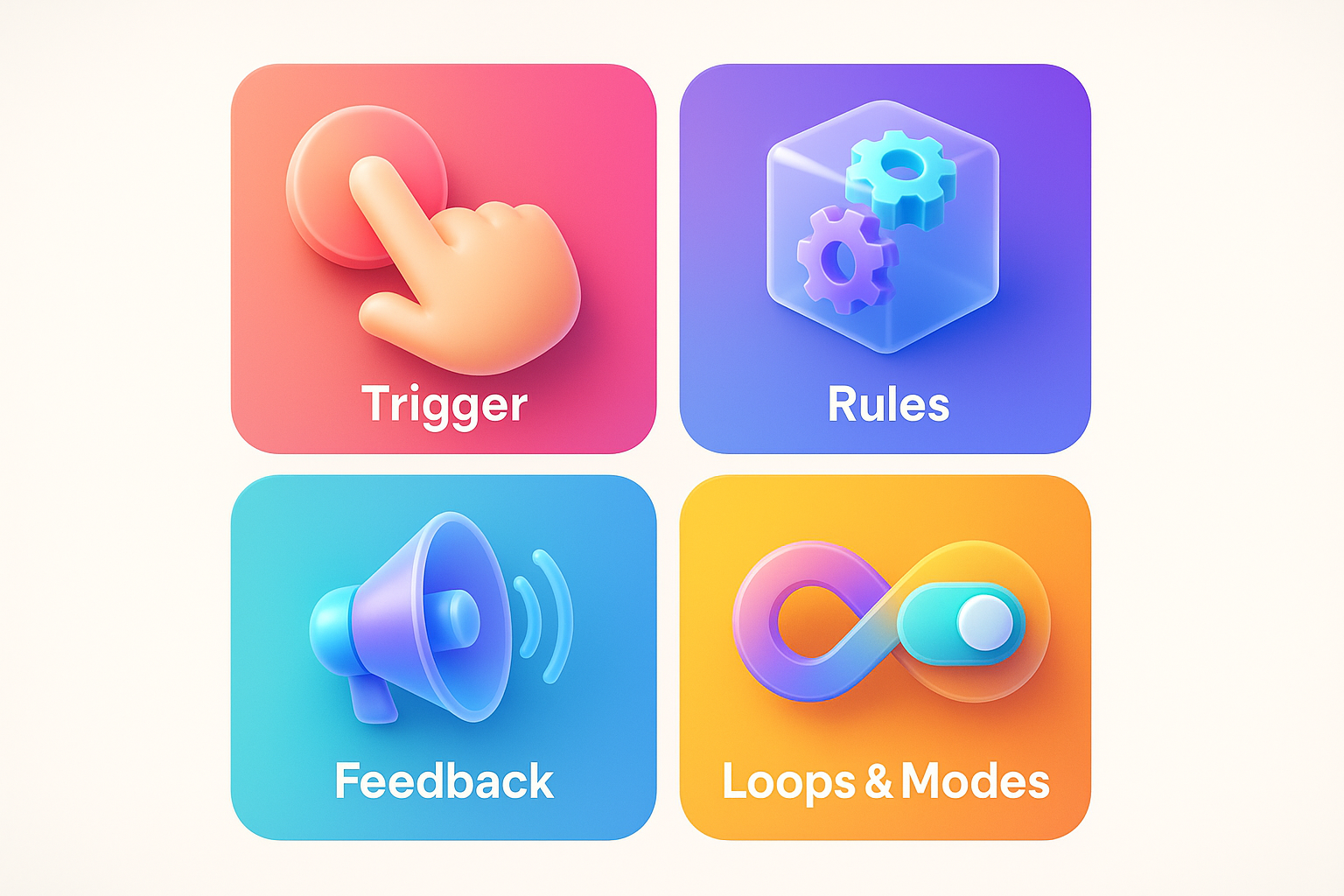
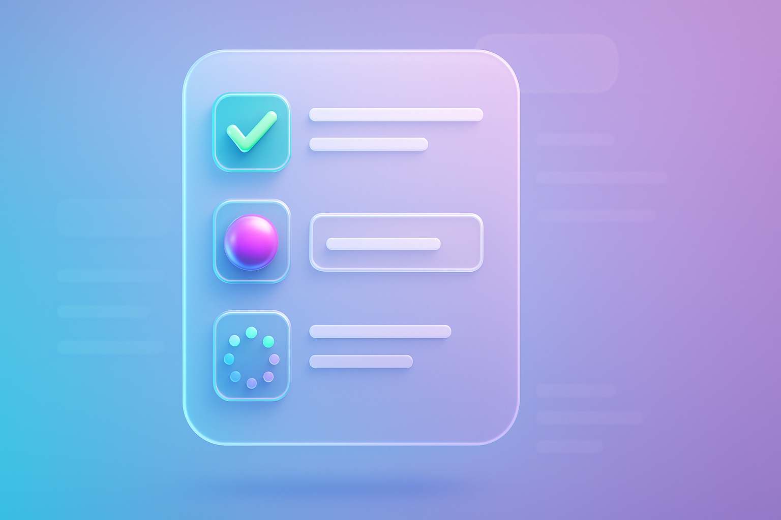
According to the accepted principles of experts like Nielsen Norman Group, the composition of Micro-International Good to consist of 4 main parts:
The best starting is to look for the most important points on your website, such as the Call-to-to -ction button, the payment process. Or various forms And start adding "life" or these little feedback. Understanding the psychology behind the design Will help you create Micro-inactions More powerful
I would like to give an example of a B2B software company that has encountered a big problem. Customers come to the page "Request a quotation" a lot, but fill out the form very little. The team went to inspect and found that their form is both long and boring. Nothing said where to fill out. Or which channel is wrong
What to do: They decided to overhaul this form as well. Micro-inactions
Results: Just adjust it. These Micro-inactions, Form Completion Rate, an increase of up to 60% and also received praise from customers that "It is the experience of filling out the best form ever." This is a clear example that the UX/UI is good and cares about the details. How can the person who are about to leave the web into a good customer?
Read here You probably want to start to improve your website, right? Try using this simple checklist to start immediately:
You don't have to do all of this at once. Just choose 1-2 as important and start to do it. The tools like Webflow also have an interaction tools that help you create these things much easier.
Q1: Enter Animation or Micro-International Will these websites slow down?
A: It's a very good question! The answer is "No, if done correctly." Micro-inactions Most of them use CSS Transitions/Animations or SVG files, which are very light and does not affect the web speed at all. What should be avoided is to use a large GIF file or an unnecessary script. Web speed is always the heart.
Q2: It's just a beautiful toy, isn't it? Do you need to do it?
A: No! As explained that its main function is "Communication and feedback" to reduce confusion Increase confidence And guide the user to the goal Beauty is just a pleasure. But its true value is to create Excellent user experience (UX) which has a direct effect on the conversion rate and customer loyalty.
Q3: If there is no basis for writing code at all Can you do these things?
A: Of course! Currently, a modern website creation platform, especially the Webflow, has a Visual interactive and animation tool that you can click to create amazing results without having to write a code, even one line. Or if wanting a results above the UX/UI Design expert , it is a shortcut to success.
Q4: Should start adding micro-inactions. Where is the best first?
A: Start with "Money-Making Actions" or the most important point for your business first, the Call-TO-Action (CTA) button (such as applying, order, contact) and of information , because the improvement of these points will affect the business results clearly and as quickly as possible.
At this point, I believe you have seen that Micro-inactions is not just the "small details" that can be done or not, but it is the "key" of the experience of impressive and different users. It is a bridge that connects the web function and the user's feelings. Change from uncomfortable relationships into a smooth and trustworthy conversation.
Investment is effective in paying attention to these details. Is to tell your customers that "We care about you." "We care about your every step" and this feeling will change from just "visitors" into a "customer" and finally became "True fan" of your brand
Don't let your website be just a lonely online brochure. Try to get up to explore your website now and find a "small point" that you can add "life" to it. It may be just one button and you will definitely be surprised by the great results!
Want Vision X Brain to help you "fill your life" to the website too. Micro-inactions That is both beautiful and creating business results, right? Consult our experts for free! We are ready to change your website to create a remarkable experience until customers have to wow!

Before adjusting the UX, people enter the website and then get out. But when removing the new design Become the best off the sale point instead!

After re -the brand with Vision x Brain, sales x3 in 2 months!

Change the web with VISION X Brain for just a few days. New customers start to understand our business immediately.

After the Reemine and Vision X Brain, organizational customers start to book through the website themselves - do not rely on connections like before.

After changing the website with Vision x Brain, the user dares to test the system from the first page - no need to follow the call or explain again.

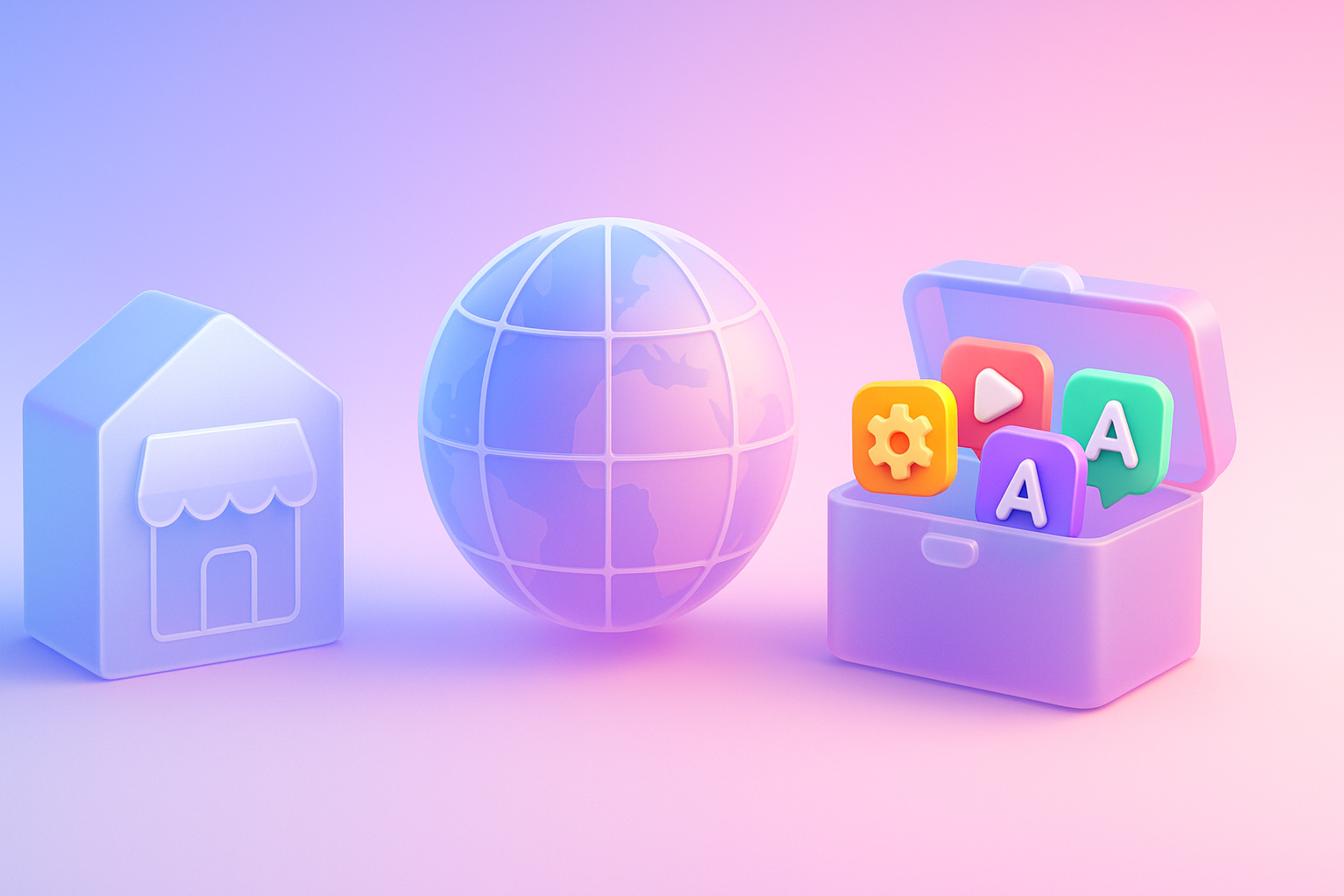
Want to sell all over the world? Compare advantages-disadvantages during the use of Shopify Markets and language translation apps. (Mulilingual Apps) to select the system that is most suitable for your store.

Add customers to rent with SEO! In -depth, SEO strategy for rental businesses, especially from Local SEO to the product page.

Stop wasting time making a reportable! Teach you how to connect to N8N with Google Looker Studio (Data Studio) to create a Dashboard and automatic marketing.