
June 23, 2025
Have you ever been? You take several weeks with the design of the Landing Page on the webflow. Place everything beautifully. Choose a picture that thinks "bang the most". Write Headline, which thinks "the most sharp", but when actually releasing the website ... instead has to sit and guess the customer that "Eh ... Why do people refuse to click the order button?" Or "If we change the color of the blue button to orange Will the sales increase? "Or" text on the button 'buy now and' See more details', which is better? "The feeling of working on "Unsure" and decisions that are based on "Personal feelings" are all. This is a problem that many designers and business owners who use Webflow are facing. It was the pain that saw the traffic running to the website but could not change to sales as hoped.
Prompt for illustrations: Website designers are sitting in the temples in front of the computer that opened the webflow program with an arrow pointing to the two CTA buttons (different colors) with a large question mark floating above the head.
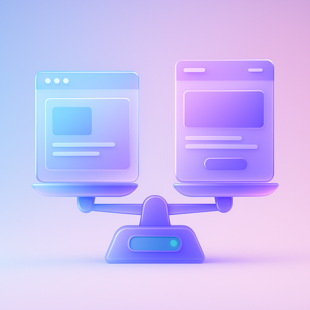
This problem is not born because you are not skilled in design. But due to the "lack of information" in the decision Webflow's very high flexibility and freedom allow us to create hundreds of thousands of different designs. Which is a double -edged sword Because when there are a lot of options We tend to make decisions based on "instincts" or "personal taste" as the main design A, more beautiful than B, so we choose A type without real information to support whether our customers ... think like us or not? The source of the problem is "Design by Feeling" instead of "Data-Driven Design", we tend to be trapped in a trap that "If we like customers, it should also like" in the real world. It's not always like that.
Prompt for illustrations: simple infographic images Show the left hemisphere (Logic, Data and Creativity (Creativity) (Creativity), with a large arrow pointing from the right to the word "Website Design" and has a cross mark. And with a green arrow pointing from both hemisphere to the word "High-Converting Design"
Leaving the design of the design on the "guessing" continuously, resulting in more serious adverse effects than expected. The first thing is "Loss of sales opportunities" every day that your website is not the most effective. You are losing customers and income that should be yours. The second is "Waste marketing budget." You may throw a lot of money to pull people into the web. But if the webpage cannot change the visitor into customers Those money is like pouring water on the sand. And the most important is "The competitors will overtake you" while you continue to "guess". Your competitors may be using information from A/B Testing to improve their website every day until finally, your website will only become a beautiful website. That no one bought Releasing this problem is no different from rowing in the basin, although your goal is the vast ocean.
Prompt for illustrations: 2 graph images compared to the first line named "Your website" is a horizontal graph, represents a constant conversion rate. "Competitors' website" is a graph that gradually rises with the sign, "Optimized with A/B Testing".
The solution from the "Debayment" cycle has only one name. "A/B Testing". It is a scientific process that is applied to marketing and design. There are 2 simple principles: "Create 2 versions of design (or more) and test with the actual user to see which version of the conversion is better." Instead of arguing in the team, which color buttons are more beautiful than we give "information" as a referee.
And where to start? Start with "the highest impact" (High-Impact Elements) always:
tools that are necessary for A/B Testing Webflow. But the most popular person is Google Optimize (despite the announcement of the service But the principle remains the same) and other tools like VWO or Optimizly, which can be connected to your webflow website is not difficult.
Prompt for illustrations: Infographic images showing 5 main components that should be made A/B Test (Headline, CTA, Hero Image, Layout, Offer) with each topic.
In order to be clearer I would like to lift the resolution case of the E-Commerce store created with Webflow. Sell organic skincare. They have a beautiful landing page, but Conversion Rate does not move at 1.5%. The first two CTA button (version A) is the green button with "Shop NOW", which is always used and the B-version (version B). That they assume that it would be better Is the same color button but change the text to "Revealing clear skin in 14 days"
So they decided to do A/B Test using a 50% traffic to the webpage to see the version A and another 50% to see version B and measure which buttons are clicking and leading to the order more successfully. After running the campaign for 2 weeks, the results are very remarkable!
Version B, which uses the message "Reveal clear skin in 14 days" can create a click-through rate (CTR) higher than the version A to 35%, and most importantly, it increases the overall conversion rate from 1.5% to 2.5%! This is the power of changing just "A few messages" based on information from the test Not feeling This is a clear example of adding conversion to the Landing Page with a simple principle.
Prompt for illustrations: Comparison images of the Beore/After Smart screen that shows two CTA buttons (A: "Shop Now", B: "Revealing clear skin in 14 days") with clear results, such as "Conversion Rate +66%".
Ready to change to a data collection, right? This is the process of making a/b testing on your webflow web. That you can start immediately:
For beginners, look at the advice of making a/b testing for e-commerce to find more ideas.
Prompt for illustrations: Flowchart image 6 steps to make a/b testing on the webflow from Goal> Tool> Create> Setup> Run> IMPLENT with easy -to -understand icons at each step.
Q1: How much traffic must have a traffic to do A/B Testing?
A: This is a classic question. No fixed answer But the principle is to have a "conversion" that is enough each week (at least 20-30 conversion per version) in order to get a reliable result. If your website has a very small traffic rate, but if a lot of traffic, but the conversion rate is very low . Explain this very detailed.
Q2: Webflow has a built -in A/B testing feature?
A: At present (June 2025) Webflow does not have a built-in A/B Testing feature. We need to use the THIRD-PARTY to help, which is a standard method that marketers around the world use. And can connect to Webflow without problems
Q3: How long should you run each time?
A: The recommended time is at least 1-2 weeks or to complete 1 Business Cycle (for example, if your customers tend to decide to buy the weekend. Should also cover the holidays) to avoid the discrepancy from the behavior of users each day And the most important thing is to wait until the tools have informed that the results are "Statistical Significance" up to 95% or more.
Q4: Will A/B Testing negatively affect SEO?
A: It doesn't have a disadvantage. If done correctly, Google understands and supports A/B Testing to develop user experiences. What you need to do is use. "REL = Canonical" Tag on the version B page points back to the version A page to tell Google which page is the main page. Which most A/B Testing tools will manage this
Prompt for illustrations: The first 4 cartoon characters are looking at the traffic graph, the second is looking at the webflow logo with a question mark, the third is looking at the calendar, and the fourth is looking at the Google logo with a green mark.
At this point, I hope that everyone will see that A/B Testing Webflow is not a distant or complicated thing as you think is the "compass" that will guide your website to the desired goal. It is a tool that changes the design from "guessing" to "understanding" true customers. Just a little modification based on data Able to create an unbelievably great business results
Do not let the Webflow website that you intend to create well. Must not work at full potential anymore The key is to "start". Do not wait for everything to be perfect. Try choosing a small element. One thing that you are most suspecting, assumptions and start your first test today. Learning from real information, even a little Is always more valuable than predictions that are always beautiful
It's time to change your website to make money that works with the most effective! If you want Conversion Rate Optimization or want to create a Landing Page with high conversion, especially our team, ready to consult and help you at every step!
Prompt for illustrations: CONVERSION RATE graph that rushed into the sky. With a rocket that has a sign "A/B Testing" is flying up With a big message "Stop Guessing, Start Testing!"
Before adjusting the UX, people enter the website and then get out. But when removing the new design Become the best off the sale point instead!

After re -the brand with Vision x Brain, sales x3 in 2 months!

Change the web with VISION X Brain for just a few days. New customers start to understand our business immediately.

After the Reemine and Vision X Brain, organizational customers start to book through the website themselves - do not rely on connections like before.

After changing the website with Vision x Brain, the user dares to test the system from the first page - no need to follow the call or explain again.


Add customers to rent with SEO! In -depth, SEO strategy for rental businesses, especially from Local SEO to the product page.

Stop wasting time making a reportable! Teach you how to connect to N8N with Google Looker Studio (Data Studio) to create a Dashboard and automatic marketing.

Make the user "smell" the desired information! Learn the principle of "Information Scent" to design the Navigation and UX that guides users to the goal and add conversion.