
June 22, 2025
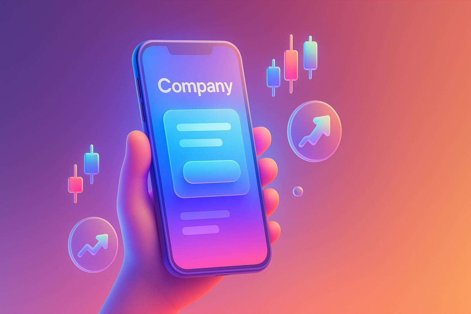
Imagine ... You are an investor who is seriously interested in shares of the company A while traveling. You know important news about the company. Therefore quickly grabbed the smartphone to find information "Annual Report" or "Latest Quarter Establishment" on the Investor Relations (IR) website, but what is found is ... The letters are tiny until the finger must be zoomed in, zoom in, zoom out, the table is overflowing the screen until you have to slide left and right, the download button is so small that pressing the wrong link before finding the PDF file that you want to see. Made tired and frustrated until almost wanting to throw the phone away This is a problem that many investors and shareholders are actually encountered in the era of mobile phones. But the website of many listed companies has a completely disappointing mobile UX user (Mobile UX).
Prompt for illustrations: Image of investors/male and female businessmen Are frown and try to look at the smartphone screen that shows the website with a small and messy text. The background is a travel atmosphere such as in the electric train or airport.
The question is, although the technology goes this far. Why is the website of a large organization? Especially the web for investors of listed companies (LP) to "falling dead horses" about mobile experiences? The main reason is often from these ideas trap:
These trap make Mobile UX of the listed company website become an overlooked blind spot. In fact, it is the most important door to communicate with today's investors.
PROMPT for illustrations: 2 comparison screens. One is a large computer screen that shows the beautiful IR website. Another screen is a mobile phone that shows the same website, but the layout is overlapping. To convey the focus of only Desktop
Having a bad Mobile UX on the investor website is not just a small matter that causes users to lose emotions. But it can be corroded "Reliability" and "image" of the company enormous in the long run. Take a look at these effects:
Releasing this problem is like allowing water to gradually Absorbed the foundation of the house In the end, the damage that occurred may not be able to assess.
Prompt for illustrations: The stock graph of one company is going down. Along with the reflection of the hand that is pressing to close the website that is difficult to use on mobile To convey the impact on confidence and stock price
The good news is that this problem can be resolved. And should start by changing the way of thinking from the web "For computers" as a design based on "Mobile-First" is the design for mobile screen first. And then expand the results into a larger screen This is the point that should start to fix immediately:
Starting from these 4 points, it will lift your MOBILE UX machine. Your company's website to return to impress and reliable quickly.
Prompt for illustrations: beautiful and easy to understand, show 4 icons instead of 4 topics: 1. navigation menu icon 2. Speed meter icon 3. AA icon (AA) 4. Finger icon that is pressing the button with the message "Mobile-First for IR"
In order to be clearer I would like to lift the resolution of "Future Development Public Company Limited" or "Phatthana Phatthana" that had experienced the problem of Mobile UX before their original IR website almost can't be used on mobile phones. Causing the analysts and investors to complain in one voice that "Difficult to find information and non -professional"
The mission of turning: The executives of "Phatthana PLC" are aware of this problem and decide to invest in all new IR websites by collaborating with Website development experts, investors, focusing on Mobile UX as the main heart They change the complex menu into an easy -to -reach menu, improve the report page to display as a "Key Highlight" that is easy to read on the mobile phone before downloading the full version, and analyzed the UX of the IR website thoroughly to reduce all unnecessary steps.
Tangible results: After launching a new website for only 3 months, what happened is:
The case of "Phatthana Limited" proven that investment in Mobile UX is not cost. But is investment in "Reliability", which is an ineffective asset of listed companies
Prompt for illustrations: The Before & After mobile screen shows the IR website of "Phatthanakan" before and after updating. The After side shows clean and clear results, clear and reliable.
Read here You probably already want to know how good your company IR's IR website is. Mobile UX. Try to pick up your smartphone and follow this easy checklist.
If you can tick every item Congratulations! But if you find any thing that is still stuck, that is the "opportunity" that you will start to improve to build confidence for investors today.
Prompt for illustrations: Beautiful checklist image on a reliable background. There are each icon, such as timer, timer, treasure map, thumb, rockets, phones and tables to make the audience easy to understand and want to follow.
We have compiled a question that the management team or the IR department of listed companies often suspect about Mobile UX to answer clearly.
Question: A large investor or investor He doesn't use a large screen computer. In data analysis?
Answer: True, in -depth analysis is also done on the computer, but the "first step" of search, Urgent news, or basic information to screen stocks. Always occurs on mobile phones If your website creates a bad experience from the beginning It may be eliminated before reaching the in -depth analysis process on the computer.
Q: Our website is a Responsive Design. Isn't it enough?
Answer: Responsive Design that just makes Layout not broken on mobile "not equal to" Good Mobile UX. Responsive makes "see good" but good UX makes "easy to use and impressive". With a well -decorated building, ready for people to live happily. Having a UX/UI design team, especially will help upgrade only the "can be used" as a "excellent" website.
Q: Mobile UX renovation requires a very high budget?
Answer: Not always necessary. Can start with the updates in the first high impact (low-hanging fruit) such as button size adjustment, font color correction, or compression of image files Which does not use a lot of resources but see results immediately Investment in this matter should be seen as an investment for treatment. The "credibility" of the company, which is definitely worth the loss.
Question: How do we measure the success of Mobile UX?
Answer: Can measure the results of many dimensions, such as BondCe Rate (the rate of hit) on the reduced Mobile, Time On Page (time used on the increased website Mobile, the number of downloading reports via mobile phone Or even quality feedback from investors and analysts
Prompt for illustrations: Cartoon characters or icons, people scratching their heads with suspicion. With a large question mark (?) And the other side is an expert to give an answer confidently
At this point, we probably saw the same picture that Giving importance to the Mobile UX of the listed company website Not just about the design trend But it is to show respect for investors, building confidence, and the modernity of the organization's vision. On the day that the information runs faster than the rocket And investment decisions can occur anywhere, anytime on the palm Having a "ready" website provides smooth information on mobile phones. Therefore is an indispensable thing anymore
Allowing your IR website to have a bad experience on mobile phones It is no different from being impolite to meet important investors. It may not be illegal. But it completely destroyed the credibility and impression.
It's time to change your investor website from "The burden that must have" becomes the "most powerful confidence tool". Start checking and improving your Mobile UX from today. Before the business opportunities and investors' confidence slipped unfortunately!
Need a professional team that understands both the techniques and needs of listed companies to help take care, right? Consult our experts for free! We are ready to help you create an IR website with excellent Mobile UX to enhance investors in full.
Prompt for illustrations: Powerful last picture Is a mobile phone that shows a beautiful IR webpage and easy to use With stock graphs rising as a background Conveys positive results and success
Before adjusting the UX, people enter the website and then get out. But when removing the new design Become the best off the sale point instead!

After re -the brand with Vision x Brain, sales x3 in 2 months!

Change the web with VISION X Brain for just a few days. New customers start to understand our business immediately.

After the Reemine and Vision X Brain, organizational customers start to book through the website themselves - do not rely on connections like before.

After changing the website with Vision x Brain, the user dares to test the system from the first page - no need to follow the call or explain again.

Compare shocks, shock between Webflow and Framer for Startup that emphasizes the opening speed, beauty and scale ability.
Web speed is not just technical! In -depth that Core Web Vitals (LCP, Inp, CLS) affects SEO ranking, user experience And how the profit of the organization web
Don't overlook Footer! A collection of Website Footer design techniques that help improve UX, supplement SEO and change the visitors to become the Lead.