
July 20, 2025
Have you ever felt like this? You are dedicated to both physical strength and designing the website beautifully. The content is interesting. But when the user scroll down to the end of the web Instead, they found a dead end ... just found a copyright message with a small logo. That can't do anything Finally, they closed your webpage unfortunately. This is a problem that is like a "blind spot" that many website owners and marketers often overlook. We call it "Dead-End Footer" or the end of the web that is not lively. Is just an area to tell according to tradition But does not act "navigation" or "creating opportunities" at all
Users who intend to scroll down to the end Is a group of people who are very interested in your brand! He may be looking for information, contacting, wanting to know what the company you have, or are looking for a signal that makes them feel more "confident", but when your Footer has nothing for him to continue. Equally, you are releasing "The good customer" to slip in front of the eyes This problem does not cause you to lose only traffic, but you are losing the opportunity to create a Lead and close the sale enormous.
-Prompt for illustrations-
Infographic style. The left comparison is a Footer image that is just a copyright with a small logo. And there is an arrow pointing out of the website with a question mark (?) Conveys the "dead end". The right side is a good Footer. With an arrow pointing to the Lead icon or the money to convey "Creating opportunities"
The reason that Footer is often designed to be asked. There are many factors. Most often caused by misunderstanding that it is just "Secondary components" that are not as important as the head (Header) or the main content of the website. Let's see why this problem arises:
Because these reasons, Footer became just the "end" of the website instead of the "door to the next opportunity", which changed the view and focus on it. Will help unlock the unbelievably hidden potential
-Prompt for illustrations-
Images of people designing websites on the computer By zooming to the beautiful Header section, but the Footer below is just a square, empty, gray color To convey the neglect
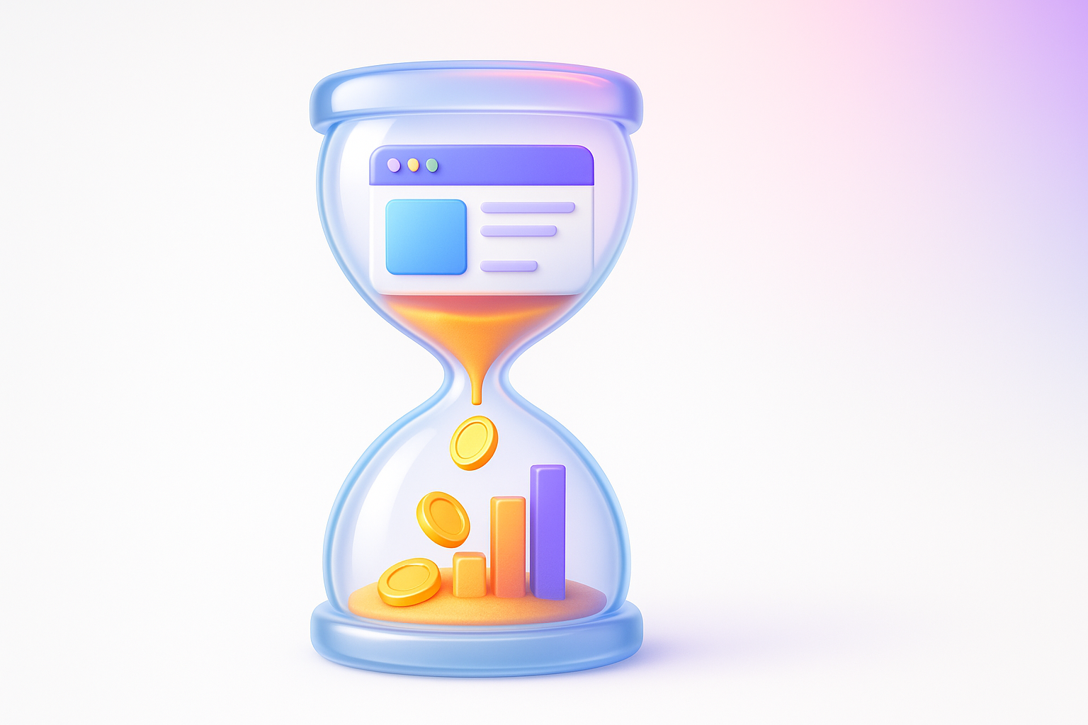
Having an ineffective Footer is not just a matter of incomplete design. But it directly affects the business and SEO in the long run unexpectedly Imagine:
-Prompt for illustrations-
The graph that shows the reduced conversion rate and the higher bounce rate, with an empty Footer icon as a indicator in the middle of the graph.
The good news is to change the Footer from the "dead end" to "the tool to create opportunities". The key is to think with strategies that we want the user to do next. And how can we facilitate him? This is a guideline and element that should be considered.
1. Start with the main goal (Define Your Goal): What do you want from Footer? Increase the application for the Newsletter? Stimulate people to contact? Or guide the bestseller? Having a clear goal will help you choose the correct element.
2. Strategic linking structure:
3. Put the power call-to-to -ction (CTA):
4. Contact information and Trust Signals:
A good start is to outline the structure on paper first. Then prioritize the information based on the principle "Simplicity and Clarity" is important. Try to read the Footer Design Design Guidelines from Smashing Magazine to find more inspiration.
-Prompt for illustrations-
The infoter images divided into 4 main parts, namely 1. Navigation links (with map map icon), 2. Call-to -ction (There is a megaphone icon), 3. Contact Info (with a telephone icon), 4. Trust signals
In order to see the image clearer I would like to give an example of the case of "Vision X Brain". In the past, our Footer used to be simple. There is only necessary information in accordance with the standard, with logo, basic contact information, Social Media and Copyright links, which are "available" but not "maximum benefit".
Problems encountered: We found that users who read the blog articles until the end (Which is a group of people who are highly interested in our service). There is no clear "bridge" to guide them to the service or stimulate contact immediately. They have to move back to the top to find the main menu. Which creates an unnecessary friction
How to solve problems and results: We have adjusted all the new Footer structure using the principle. "Conversion-Centered Design"
Results: After adjusting the new Footer, we found that the click from Footer to service pages increased by more than 40% and the number of leads that came from pressing the "Get A Free Consultation" button in Footer significantly increased. This is a proof that Footer is well designed. It's not just the end of the web, but it is a "salesperson who works for you 24 hours." Really, you can see more good practices from the article of Orbit Media Studios , which provides very good in -depth information.
-Prompt for illustrations-
The comparison image of the Footer website by Footer. The "Before" side is a simple design and the "After" side is a new design that is full. The column is clearly divided and has outstanding CTA buttons.
Ready to change your footer, right? Try using this checklist as a guideline for inspection and improvement:
Part 1: Structure & Navigation
Part 2: Creating Lead and Conversion (Lead Generation & CTA)
Part 3: Trust & Credibility
Start by checking your website with this checklist, you will definitely see the point that can improve. Investment with Footer today will definitely return the return on the next day.
-Prompt for illustrations-
Beautiful checklist images according to the list above There is a channel to tick correctly. With a small assembly icon In each topic, such as icons, plans for Structure, arrow icons, targeting for CTA, and Lo -shaped icons for Trust.
I have compiled a popular question about the Footer design with clear answers and actually used.
Question: Put a lot of links in the Footer. Will it help with SEO more?
Answer: Not always. In the past, wearing a lot of links may be effective, but now Google is much smarter. They are more interested in "quality" and "links" of the link. "Quantity". Entering unrelated or too much links can make it look like spam and negative effects. Should choose only important links and are really useful to users The strategy of creating a good Internal Link is a natural connection.
Question: Footer should have the same design on every page?
Answer: In general. "Yes." Having a consistent Footer (Consistent) on every page will help create a good experience and do not confuse the user. There may be a reduction of the elements in the Footer to be only needed.
Question: Should I put an animation or striking graphics in Footer?
Answer: Should be done carefully. The main goal of Footer is "clarity" and "utility". The use of animation that is too heavy can cause the webpage to load slowly and disturb the user. If used, it should be a small animation that helps to enhance UX such as Hover effect on the button or link. But the main heart is still simplicity and real use (Simplicity and functionality)
Question: Footer design for Mobile, should it look different from Desktop?
Answer: Responsive design on mobile phones with a limited space. Footer display with many Desktop columns may look messy and difficult to use. The good way is to adjust to a single row. Or use the Accordion Menu menu to organize a link to save space and look clean The important thing is that the button and link must be large enough to press with a finger easily.
-Prompt for illustrations-
The cartoon characters are sitting and having a question mark (?) Floating above the head. With the background as the structure of the Website Footer
We have arrived at the final part of this article. We can see that Website Footer is not just "the remaining space" at the end of the website anymore, but it is a "digital asset" that has a lot of value if we design it with a strategy. It is the last strategic that will help guide the user, create credibility, enhance SEO efficiency and most importantly, change visitors with high quality interest into quality Lead.
Your Footer investment today Is to open the door to new business opportunities That you may have never expected before, do not let the "dead end" come to block the growth of your business anymore. Try to bring checklist and various techniques. That I have shared in this article to adapt to your website Start with small things And you will definitely see the great changes
It's time to change your footer to be more. "At the end of the web" but is "one of the most powerful Lead and Conversion tools on the website!" If you want UX/UI experts come to help change the website or want to create a perfect organization website. Our team is ready to give advice!
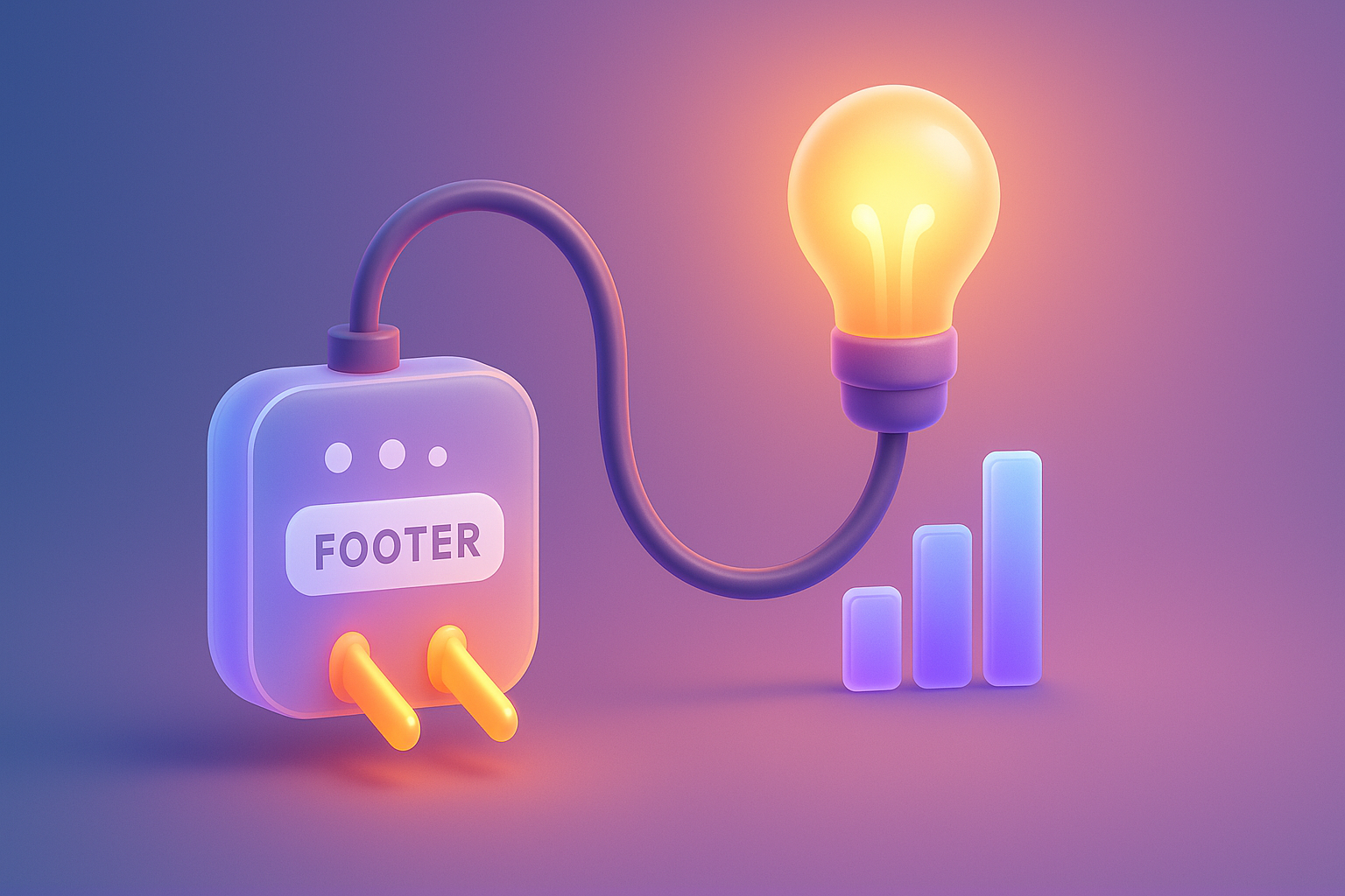
-Prompt for illustrations-
The beautiful graphic image shows the arrows rising from the website of the website to become a higher business growth graph. Conveying to change the Footer into a tool to create growth
Before adjusting the UX, people enter the website and then get out. But when removing the new design Become the best off the sale point instead!

After re -the brand with Vision x Brain, sales x3 in 2 months!

Change the web with VISION X Brain for just a few days. New customers start to understand our business immediately.

After the Reemine and Vision X Brain, organizational customers start to book through the website themselves - do not rely on connections like before.

After changing the website with Vision x Brain, the user dares to test the system from the first page - no need to follow the call or explain again.

Compare shocks, shock between Webflow and Framer for Startup that emphasizes the opening speed, beauty and scale ability.
Web speed is not just technical! In -depth that Core Web Vitals (LCP, Inp, CLS) affects SEO ranking, user experience And how the profit of the organization web

When the Browser Tracking is limited! Get to know Server-Side Tracking that allows you to collect customer data more precisely and safer. For effective marketing