Website designers, business owners, e-commerce, and all digital marketers! Have you ever felt that ... sometimes we have a website that "beautiful design" "complete information", but why ... why the customer "refused to click" "refusing to apply" or "refusing to buy" once? We tried to stimulate. But in the end it seems like a user "Do not move" anywhere?
Today's online battlefield "competition" is "fierce" even more than before. Having just a website that "beautiful" or "has a complete function" may not be enough anymore! Because the key to "change" the audience into a "customer" or "regular user" is to "understand human behavior" deeply and "website design" to "respond to those behavior smartly!
Today I will take you to get to know the "secret weapon" that world -class designers and marketers choose. ** "Fogg Behavior Model" **! This powerful but powerful model will help you "look through" into the minds of users and "motivation" for them to "do" what you want systematically. Whether clicking, application, purchase Or even reuse!
If you are ready to "unlock" the potential of the website And change it into "Machinery to create behavior" that is effective ... "go in -depth" Fogg Behavior Model with "the secret to apply" on your website "immediately"!
The real problem in life (When the website does not stimulate user behavior)
Imagine ... You dedicated the time and budget to create a beautiful webflow website. There are magnificent illustrations. The content is tight, but the conversion is not as they dream. You may encounter these problems, right?
[cite_start]- ** "Many people come to see ... but don't press anything!": ** The website has a high traffic, but Bounce Rate is also high. The user came in and then went out quickly. Without any interaction With your website [Cite: 138, 139]
[cite_start]- ** "Customers have put things on the basket ... but leave only!": ** E-commerce's classic problem shows that users are interested in a certain level, but "change your mind" in the final step [CITE: 139]
[cite_start]- ** "Not successful members / filling in the form is not over!": ** The form is too long, complicated or there are channels that users do not understand. Causing them to abandon the filling in the middle of the car [CITE: 159]
- ** "The person reading the article is over ... and then disappear!": ** Although the content is good, it is useful, but lack of stimulation for users to read more. Click on to another page. Or do what we want after reading
- ** "Good promotions ... but people don't care!": ** There is a banner or pop up. But no one clicks Or no one uses the discount code given
These problems are not just about the "beauty" of the design anymore. But it is a sign that your website may still lack "The power to stimulate behavior" users to reach the goals you set. And understanding Ideas in website design May help you see the root cause of these problems more clearly.
Why did that problem occur? (Trace the cause according to Fogg Behavior Model
[cite_start]
The source of the problem that the user "does not do" in what we want on the website. Usually circling with 3 main components in ** "Fogg Behavior Model" **. [CITE: 161]:
[cite_start]
This model says ** "Behavior" ** ** can happen only when 3 things meet at the same time, [Cite: 161]:
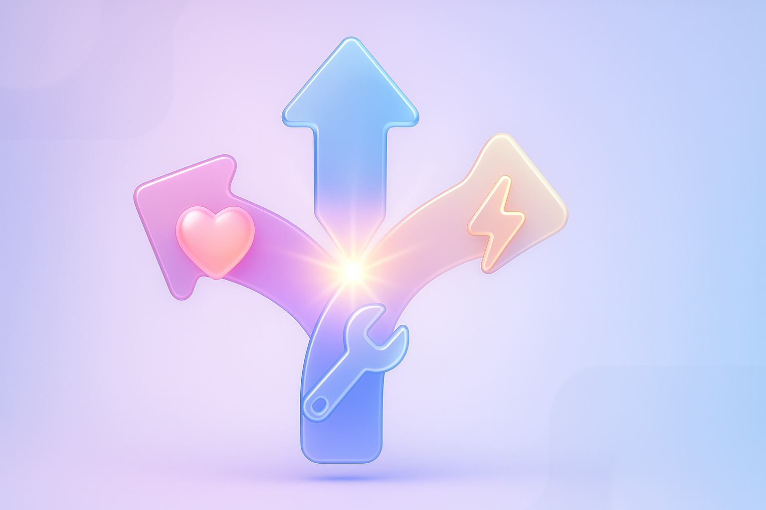
$$ behavior (B) = Motivation (M) + Ability (A) + Prompt (P) $$
How can the problem you encounter? It often lacks one of these 3 things!
[cite_start]- ** Lack of Motivation (not enough motivation): ** Customers do not feel "necessary" "want" or "useful" enough to do that. The website may not clearly communicate the value of the product or service. Or not creating urgent feelings for them [Cite: 147]
[cite_start]- ** Lack of Ability (the ability/easy to do is not enough): ** Even if wanting to do, the steps are "difficult" "complicated" "inconvenient" or "takes too long" until the user is discouraged first. Think of a long form Or the order process that requires repeated information. [CITE: 149]
[cite_start]- ** Lack of prompt (unclear stimulator/inappropriate): ** The user has motivation Have the ability to do, but there is no "signal" or "stimulator" that is clear enough for them to "act" at the right rhythm. CTA button is too small to blur the background. Or the text does not stimulate at all It is considered this [CITE: 158].
Many times we tend to devote to "Creating motivation" only (such as doing strong promotions) but neglected "Easy to do" or "The right stimulation" makes the behavior not as it should be. This is the trap that makes the website "beautiful but the picture" and "truly sells"!
If left, how will it affect? (The impact is clearly visible)
Ignoring the problem of stimulating users on the website Not just losing opportunities But it still has a huge impact on your business. And sometimes even too late!
[cite_start]- ** Conversion Rate. Dropped: ** This is the most clear effect. When the user does not do as you want Whether buying, applying, or contact means you are "Loss of customers" and "losing business opportunities" every day [CITE: 168]
[cite_start]- ** Free advertising fee: ** You may spend a budget for advertising. To pull people into the website But if your website cannot turn them into customers Equal that you are "Burning money" every day every month [Cite: 173]
[cite_start]- ** Damaged brand image: ** Difficult website Or not responding to user behavior Will make customers feel "Not friendly" "not reliable" and may result in the image of your brand. "Not professional" in their eyes. [Cite: 174]
- ** The competition is so high that your competitors may be using these techniques to "win customers" from you. It will make you "falling" in this high competition market.
- ** The cost of finding a new customer higher: ** When the conversion rate is lower, you will have to spend more money to find each new customer. Which directly affects your business profits
This is the reason why "investment" in understanding and applying the Fogg Behavior Model to improve the user experience, so it's not just "options", but it is "necessary" to survive and grow in this digital age. And understanding the UX design for SAAS customers is a good example of this investment.
Is there any solution? And where should it start? (Unlock behavior with Fogg Behavior Model)
[cite_start]
When we understand that the behavior is caused by Motivation (motivation) + Ability (ability/easily) + Prompt (stimulator) [Cite: 161] The solution must be targeted to 3 at the same time. And this is how you should start:
1. Add Motivation (make "want to do")
- ** Value Proposition as clearly as possible: ** The user must know immediately what they will get from your website, product or service. Why is it you? What is the benefit? [cite_start] Use Headline and Sub-Headline that is powerful from the beginning to see [CITE: 147, 184, 185].
- ** Create urgency (URGENCY) and shortages (Scarcity): ** For example, "remaining x hours", "Limited product", "This discount is only the end of the month"
[cite_start]- ** Use Social Proof: ** Show reviews, testimonials, famous customers, or successful users To build credibility and conform to [CITE: 211, 214, 215]
- ** Linked with "Pain" or "desire" of users: ** Talk about the problems they are encountering. And shows that you are the best solution
2. Add Ability (make "easy to do")
[cite_start]- ** Reduce friction in every step: ** Make the process easier as possible. Whether filling in form, ordering, or subscription [Cite: 149]
[cite_start]- ** Clear Visual Hierachy design: ** Navigate the user's eyes to the most important thing. Use letters, colors, and free space. [CITE: 188, 191, 192, 193]
[cite_start]- ** Mobile-Friendly Perfect: ** Because most users enter the website via mobile The button must be pressed easily. The text is clear, no need to zoom [CITE: 161, 219, 221].
[cite_start]- ** Form must be short and easy to fill: ** Ask for information as needed, with Placeholder and Error Message friendly [Cite: 159, 204, 209]
[cite_start]- ** Add Page Speed: ** Websites that are downloaded The user will feel good and tend to continue to use until the end of the [CITE: 227] process.
3. Add Prompt (make "have the right stimulator")
- ** Call-to -ction (CTA) that is outstanding and clear: ** The CTA button must have contrasting colors, large enough, and text that stimulates the action, not just "click here", but "get a discount immediately!" [Cite_start] or "Start using for free!" [Cite: 158, 196, 198, 200]
[cite_start]- ** Place Prompt in the right position: ** There should be a clear CTA from ABOVE THE FOLD and has a CTA.
- ** Use notification or pop-up wisely: ** Not too much to disturb But used at the right rhythm such as POP -UP. Special offers when the user is leaving the webpage (Exit-Intenant Pop-up
- ** Create "Small Wins": ** makes users feel like a little little by little, such as Progress Bar in a long form.
Good start is ** "Analyze your current website" ** According to the composition of Fogg Behavior Model. Try to ask yourself if "Is the user motivated enough?", "Is it easy enough to do?", And "Is there a clear stimulus in the correct rhythm?" When you can specify the weakness. You will know where to start updating. And if you want to design an effective CTA, look at the best call-to -ction .
Examples from the real thing that used to be achieved (Fogg Behavior Model Case that turned the game)
In order to clearly see that the Fogg Behavior Model is "really different". I would like to give an example. "One of the SAAS project management platform that has encountered a lot of users applying for But rarely "Start using" or "continuous use"
** Before using Fogg Behavior Model: **
Most users apply because they see "features" that are interesting (Motivation are reasonable) but after applying Instead, the rate of "Drop-OFF" is very high in the onboarding (low) steps). There is no "stimulator" that is clear to do anything immediately after applying. Causing the user to be lost and not wanting to continue
** Application of Fogg BEHAVIR MODEL to solve problems: **
The team started to analyze the problem according to this model:
- ** Motivation: ** They know that users apply because they see the benefits of the feature (Motivation high enough), but the communication on the first page does not focus on the "results" that the user will really receive. They then adjust the Headline and Sub-Headline to emphasize the "success" of the customer, such as "manage the project to finish twice as faster".
- ** Ability: ** This is an important weakness! [Cite_START] The team found that the initial setting process "complicated" and "takes too long", so they "reduce the" Onboarding "shorter, create a clear" Progress Bar ", and" Step-By-Step "suggestion is a short animation. Shows that "easy to do". In addition, "Default Templates" that users can choose immediately without having to start from the center [Cite: 207] to reduce the complexity of the use. And the study of UX for the beginning of SAAS customers, it is very helping them.
- ** Prompt: ** After applying for the team to improve "Welcome Email" to have a "Start your first project" button that is outstanding and uses a clear stimulant message. There is also a "tooltip" that appears in the application to "introduce" the first function that users should do immediately when logging in the first time. This is the "Prompt that is rhythm", allowing users that "What to do next now"
** Amazing results: **
After renovating according to the Fogg Behavior Model principle, just 3 months. The "Active User" rate in the first 7 days after applying ** "Increased by more than 150%!" ** and "Rate Restruction Rate" in the long run is "better improved".
If wanting to follow, what to do? (Can be used immediately)
It's time to "do"! This is a simple checklist that you can apply Fogg Behavior Model to apply to your website immediately:
- ** Specify the "target behavior" clearly: **
- What do you want users to do on the website? (Such as applying for membership, buying products, download e-book, contact)
- Focus on the only one that is the most important first.
- ** Assess the "Motivation" of users for that behavior: **
- Your website communicates "benefits" or "value" of that behavior. How clear?
[cite_start]- Have a review, Testimonials, or other social proof that has increased? [Cite: 211]
- Your proposal is attractive enough to "Stimulate the desire" of the user?
- ** Assess "Ability" (ease of doing) of that behavior: **
[cite_start]- The steps that users must do "easy" and "not complicated" sufficient? [Cite: 149]
[cite_start]- Short form, tight, easy to read and convenient? [Cite: 204]
[cite_start]- Fast download website And works well on mobile or not? [Cite: 219, 227]
- Is there a suggestion or a helper that makes it easier to do that?
- ** Design "Prompt" (proper stimuli): **
[cite_start]- There is a Call-to -ction (CTA) that "outstanding" "clear" and "should be clicking" yet? [Cite: 198]
- CTA is placed in the "position" that the user is ready to decide? [cite_start] (such as Near important information, after the end of the section) [Cite: 201]
- Is the text on CTA stimulates the action and clearly tells the benefits? [cite_start] (such as "Start free trial", "Get a discount immediately") [Cite: 200]
- Use notification or pop-up wisely in the rhythm of "yes" and "not disturbing"
- ** "Test" and "continuous improvement": **
[cite_start]- Fogg Behavior Model is not a fixed formula, but a "thought frame" that requires "experiment" and "learn" [Cite: 202]
- Try to do A/B Testing with Headline, CTA text, button color, or procedures in the form. To see what gives the best results And if you want to learn more about using Gamification for website design Can also be applied to increase motivation
Remember that the improvement of little at a time in each component of Motivation, Ability, and Prompt will lead to a large user behavior on your website! And having a Conversion Rate Optimization (CRO) expert to help analyze and give advice to help you reach the goal faster.
Questions that people tend to wonder And the answers that are cleared
So you are confident and ready to use the Fogg Behavior Model. I have compiled a common question. With a clear answer!
Q1: Fogg Behavior Model. Can you use it on all types of websites?
A: ** Of course! ** Whether it is an e-commerce website, service website, information website, or even general blocks. This model can be adapted to stimulate the behavior that we want. Whether buying products, applying for news, downloads, contact, or even returning to read the article repeatedly, the heart is to specify the behavior you want to be clear and then use the Map model to analyze and improve.
Q2: If I have a limited budget Should focus on "M" "A" or "P" is first?
A: This answer depends on the largest "weakness" of your website. Try to analyze the data (such as Google Analytics) or from observing real user behavior:
- If many people enter the website But no one clicks anything, may be missing ** Prompt (P) ** that is clear and attractive.
- If people keep clicking, but refusing to "fill out the form" or "buy" may be missing ** Ability (A) ** is the process is too difficult.
- If people rarely go to the website Or come in and don't care about the product at all. May be missing ** Motivation (M) ** that is interesting?
In most cases, improvement ** Ability (A) ** (easy to make) and ** Prompt (P) ** (stimulating the right point) often provides fast and tangible returns first. Because sometimes the user already has motivation Only we have not facilitated them. Or haven't clearly told them What to do
Q3: How do you know that our "Prompt" is appropriate?
[cite_start]
A: The best way is ** "test (A/b testing)" **! [Cite: 202] Try changing the CTA button color, text on the button, positioning position, or even the type of Prompt (such as POP -UP is the Inline Banner) and see which type of conversion rate is the highest. It helps you to see the overall image of your PROMPT interaction better.
Q4: "Motivation" and "PROMPT) different?
A: The main difference is:
[cite_start]- ** Motivation (incentive): ** is the "desire" to do that. It is an internal factor that pushs users to want something, such as wanting this product, wanting to solve this problem, wanting more knowledge [cite: 161] [cite_start] You create motivation by presenting value, urgent, or Social Proof [Cite: 147]
[cite_start]- ** Prompt (stimulator): ** is "signal" exterior that tells the user "Let's do it now" at the right moment Is a spark for behavior. For example, the Call-to -ction button, alert, pop-up that appears at the right time [CITE: 161, 196]
Both parts have to work together! There is only motivation, but without a stimulus, there is no behavior. Or have a stimulant, but the user does not have motivation Will be overlooked
Summary to be easy to understand + want to try to do
How are you? "Fogg Behavior Model: Model Design user behavior on the website." I hope you see "clear images" that to make users "do" what we want on the website. Not just about "Make a beautiful website" but it is "understanding the psychology" of humans and "design experience" that responds to those things systematically.
[cite_start]
Always remember that the behavior of the user can only occur when there is enough ** Motivation, easily abnorm, and PROMPT, which is at the right rhythm ** [Cite: 161]. Behavior will not happen. Or difficult to happen
** It's time to "do"! ** I want you to try to go back to your website today and try "assess" each page, each step with the glasses of Fogg Behavior Model:
- Your LANDING PAGE page ** Motivation ** that is powerful enough to attract people to continue to know?
- Ordering process Or filling your form "Easy" enough for anyone to do? Have ** Ability ** high?
- And the "Call-to -ction button" or "stimuli" is clear "and" correct at the right time "enough to take the user to the next step? Is there ** Prompt ** strong?
The small improvement in each part of the MAP will create a "great result" than you can think for sure! Do not let the "user's" user interrupt the success of your business anymore! Invest in understanding of user behavior And you will see your website "Change the audience" to "customers" and "true fans"!
** Want Vision x Brain to be a "partner of the designer" to help you "analyze" and "improve" website to "stimulate users' behavior superior and" create sales "to spurt, right? Click here! Consult our CRO experts for free! No obligation! We are ready to help your website. "Work for you" at full efficiency! **