
July 15, 2025
Have you ever felt like this? When the power goes out and wanting to check the information on the electrical service provider website But instead find the menu "Report the problem / check the power outage", not found or when wanting to pay for water bills online But the steps are complicated to many layers to a headache Must fill out any information Until finally having to give up and drive out to pay at the counter as before
Not just general users Even investors who want to find sustainability reports (Sustainability Report) or journalists who need information on public relations Often encounter the same problem Is the website of the energy company and utilities. Most of the techniques are difficult to understand Complex web structure And the desired information is hardly found This is a problem that is like a "joint blind spot" of this industry. That makes the user feel frustrated and not trusting
Prompt for illustrations:
Graphic image showing the expression of users (May be elderly people, business owners, investors) that are confused and frustrated in front of the computer that opens the energy/utility website. With a complex layout icon and a question mark around
The main reason that this website is difficult to use. Not from the technology that is lagging behind, but from the "perspective" in the wrong design point from the beginning Most of them are designed by viewing from The main "corner corner" (Organization-centric) instead of looking at "The user's corner" (User-centric)
Imagine These websites are usually full of menu structures that reflect internal organizational plans. Which side is there? Use languages that are technical vocabulary or project names that outsiders do not understand. And give more importance to the presentation of corporate news or substances from executives than "missions" that users really Want to come in, such as paying bills, reporting problems, or checking the service rate Lack of understanding in Important components of the new generation of energy and public web websites Is the foundation of this problem And causing various groups of users Whether small customers, business customers, or investors feel that the website is not created for them.
Prompt for illustrations:
Infographic compare between "Web structure, viewing from the organization" (complex organizational plan) and "Web structure, looking from users" (easy to understand icon, such as the billing icon, reporting, investors) with arrows from each side to different websites.
Having a website that UX (User Experience) is not good, it may seem a trivial matter. But for energy and public utilities Its impact is severe and has a higher price than I think.
Finally These effects will be corroded. "Trust", which is the most important assets of the organization in this group slowly.
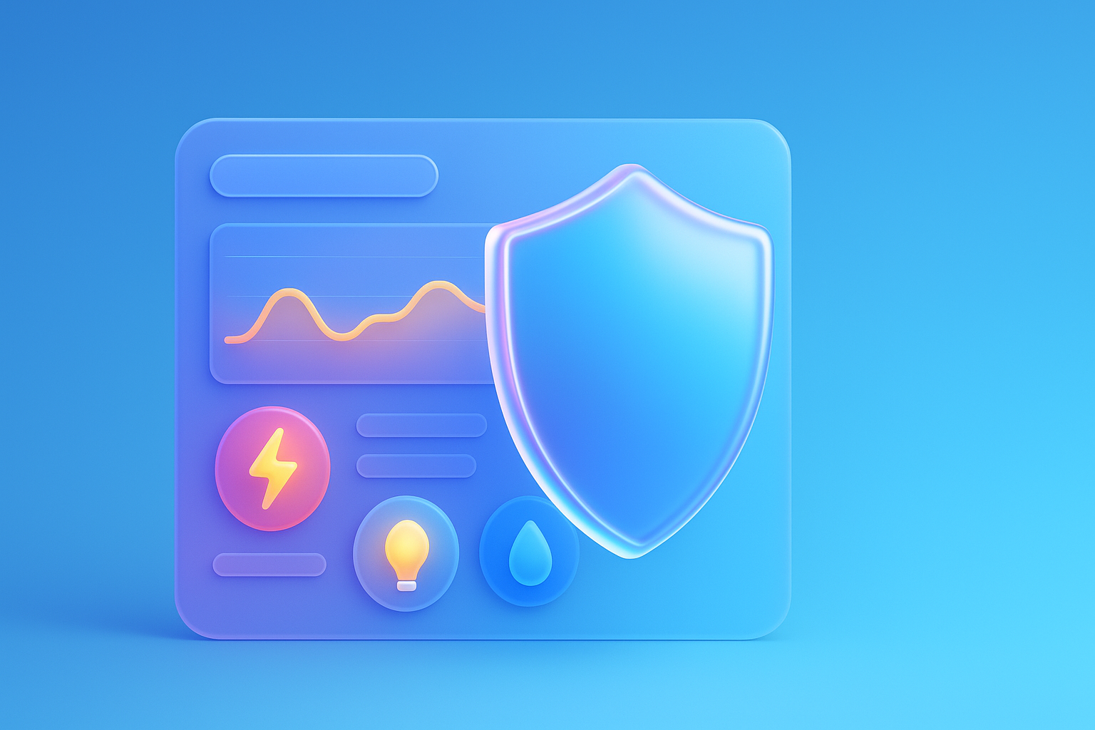
Prompt for illustrations:
The picture shows negative impacts 3-4 in one picture: the phone icon that has a long queue, stretching, star-shaped icon, which has a low score, a plumbing icon, and the cracked shield icon. To convey higher costs, reduced satisfaction, and destroyed credibility
To turn a complex website to be easy and reliable. Must start by changing the perspective to "User-centric design" truly has the following principles and procedures.
Starting from the analysis of users and laying new data structures Is the key to your UX/UI improvement and solve problems at the point.
Prompt for illustrations:
Infographic showing 4 main steps in improving UX: 1. Icon icon has an extension glasses. (Analyze users), 2. Simple web structure plan (New structure), 3. (Emphasize clarity), 4. Icon image of the disabled (access) with short text
To clearly see the image I would like to lift the resolution of "ABC Electric Company", a regional electricity service provider that has been directly faced with this problem. Their old websites are full of information that is packed. But the user could not find the menu to pay the bill Causing the call to call the Call Center to ask, "How to pay online bills?"
The mission of turning: The team has decided to invest in all new UX/UI. Beginning with the user Research and found that "payment of bills" and "inspection of power outages" are 2 missions that users need the most. They therefore designed all the first new pages, with these 2 buttons as big and outstanding. While also adjusting the billing process to only 3 simple steps and creating a map showing the power out status in Real-time that is easy to understand
Amazing results: Only 3 months after launching a new website The result is:
This is an example that proves that the investment in the UX/UI design service that understands users. Not just making the website more beautiful But is an investment that helps reduce operating costs and creating a sustainable relationship with customers.
Prompt for illustrations:
Pictures of the screen of the website "ABC Electric Company" before improving (messy, small button, can't find the menu) and after improving (clean, "billing buttons" and "Czech power" are big and clear) with a remarkable result.
It's your eyes! Try using this simple checklist to check the UX/UI healthy website. And see which points can be improved immediately
Just start answering these questions. You will start to see the opportunity to develop your website enormous.
Prompt for illustrations:
Beautiful checklist images, Infographic style with icons in each item (such as icon, picture clock, menus, document files, mobile phones) feel like a tool that can actually be used.
I have compiled a question that is often heard. About UX/UI design for websites in this industry With clear answers and can be used
Question: Our business is a large service provider. However, customers have to use. Investment is really necessary UX/UI?
Answer: Very necessary! Although customers have no choice, the "experience" that they have with your brand has a direct effect on the cost and reliability. Having a good UX will help "reduce the burden" of the Call Center, "increase efficiency" in work, and "create good images" for public and supervision. In the end, it has a good effect on the long -term business.
Q: Information in our organization a lot and very complicated. How can it "simple"?
Answer: The heart is the "progressive disclosure". There is no need to show everything on the first page. To show only the most important and necessary things first Then let the user "Click to see more details" in the part that they are interested, especially using Infographic, short video, or Bullet Point, it helps to digest complex information to be much easier to understand.
Question: Design to support everyone's access. (Accessibility) Is there a high cost?
Answer: Should be seen as a "investment" that is more worthwhile than "cost". The design that is considered Accessibility from the beginning (according to the principles of the expert association, UXPA ) will help expand the user base to cover everyone in society, reduce the risk of being sued, and is also an important factor that helps to enhance SEO scores.
Prompt for illustrations:
Illustration of the Question-Reply icon (Q&A) with icons, question markers and thought bulbs. With short keywords From each question (such as Cost ?, Complexity ?, Accessibility?)
At this point, we have already seen the same image that the UX/UI design for energy and utility websites. It's not just a matter of beauty, but it is the "heart" of communication, efficiency. And building trust in the digital age Changing perspectives from presenting things "The organization wants to say" to create an experience that meets what "Users want to do" is the most important change.
It is a website change from just "Digital Digital" that is boring to become a "self -service tool" that is effective and friendly to everyone. Try starting from today. Just try to use the checklist that provides your own website. You will definitely see the way to upgrade the user and build a strong relationship with your customers.
Is your organization ready to change the website into a door to trust and success in the digital age? If you are looking for a leading website solution for energy and utilities That is not only beautiful, but comes with an excellent UX Can consult us!
Prompt for illustrations:
Powerful final image: The user's hand is touching the tablet screen that shows the first page of the newly designed energy website and easy to use. With a background image of a clean energy power plant or modern wind turbine To convey the transition to new and reliable new era
Before adjusting the UX, people enter the website and then get out. But when removing the new design Become the best off the sale point instead!

After re -the brand with Vision x Brain, sales x3 in 2 months!

Change the web with VISION X Brain for just a few days. New customers start to understand our business immediately.

After the Reemine and Vision X Brain, organizational customers start to book through the website themselves - do not rely on connections like before.

After changing the website with Vision x Brain, the user dares to test the system from the first page - no need to follow the call or explain again.

Want to sell all over the world? Compare advantages-disadvantages during the use of Shopify Markets and language translation apps. (Mulilingual Apps) to select the system that is most suitable for your store.

Add customers to rent with SEO! In -depth, SEO strategy for rental businesses, especially from Local SEO to the product page.

Stop wasting time making a reportable! Teach you how to connect to N8N with Google Looker Studio (Data Studio) to create a Dashboard and automatic marketing.