
June 14, 2025

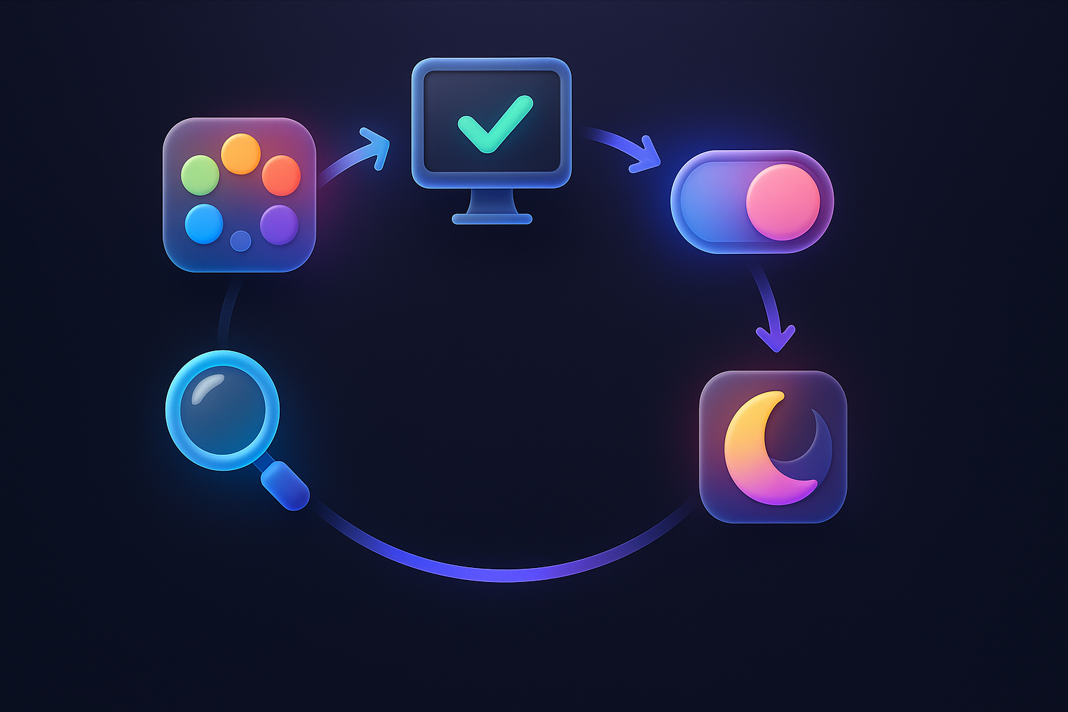
Have you ever felt that in the past 2-3 years, regardless of which app, what apps we use? Or where to go to a famous website, we tend to find the "Dark Mode" or "dark mode" to always use. Until becoming a question in the minds of business owners, marketers, and many website developers that "And our website ... is it necessary to have a Dark Mode?" It is just the beauty trend that has arrived. Or it is an important feature that affects the user's experience (UX) and the conversion rate, as they really say. Today, we will come to surgery in every aspect of Dark Mode completely. Your website should "turn on the light" or "turn off the light".
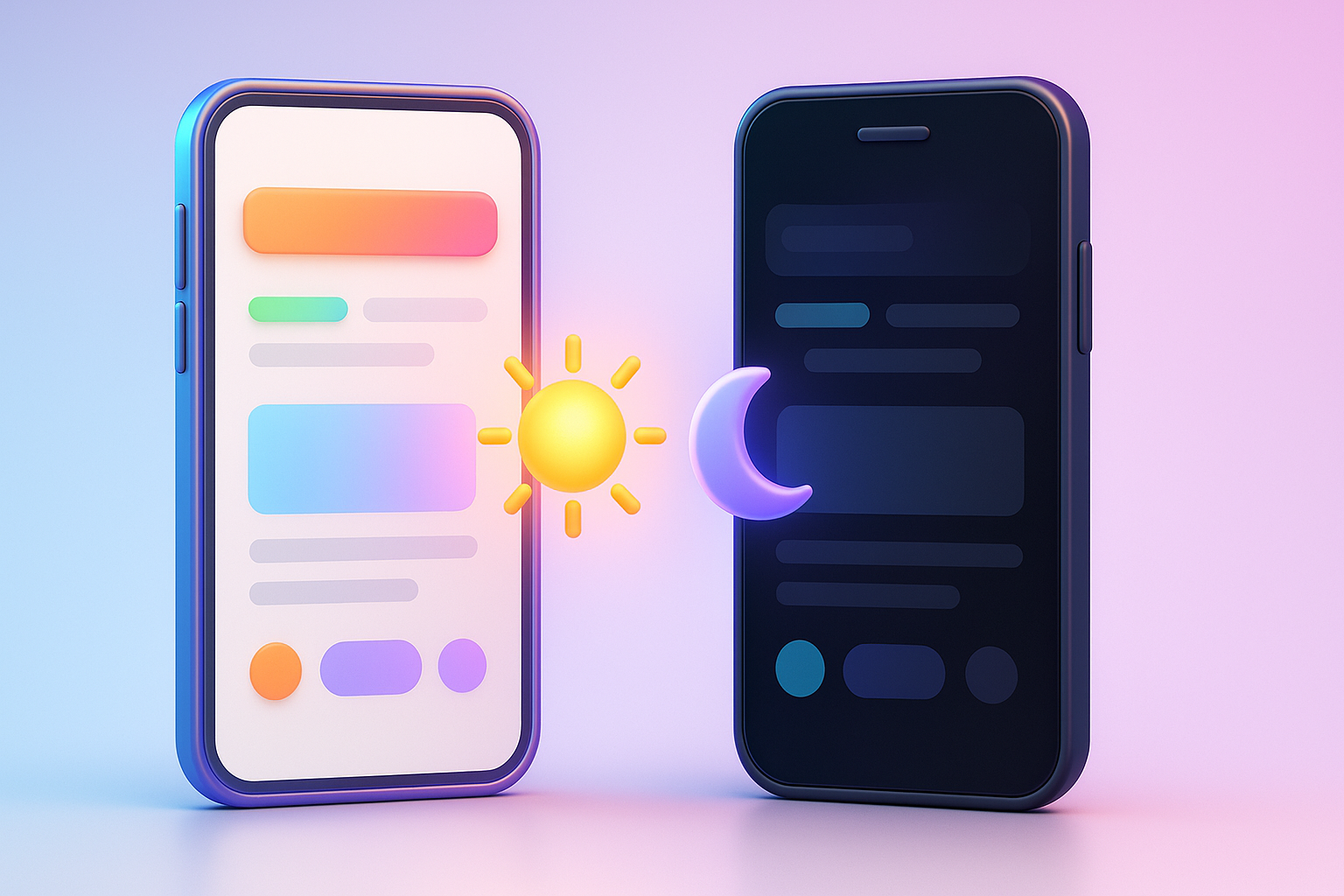
The Dark Mode phenomenon does not happen, but it has an interesting source. Starting from the developer side and programmers that have to stare at the white code for a long time, causing eye -catching They therefore like to use dark backgrounds and bright colors to reduce reflections and work more comfortably. Later, when the giant operating system like iOS and Android brought Dark Mode as the main feature in the system In addition, the popular social media apps that Thai people use throughout the house all over the city has this mode to choose from. The behavior of users began to change. People are getting used to and expects that websites and applications that look "modern" and "pay attention to users" should have this option to have Dark Mode, so it's not just about programmers anymore. But has become one of the standards of a good User Experience in the eyes of many users by default
No Dark Mode may not make your business ruined immediately. But it may affect the dimension that you can't expect. Imagine:

The answer to this is not just "must have a Dark Mode" or "don't have", but the best solution is "All -round assessment" and then decide strategically. Which should start from:
The good starting point is to ask the question: "Dark Mode will really help our customers experience better?" Not just "Why do we don't have a Dark Mode?"
In order to be clearer Take a look at the example of the app. And websites that we are familiar with, such as Youtube, Twitter, Slack, or even the Messenger and LINE apps, they are not just adding Dark Mode, but has designed all new experiences.
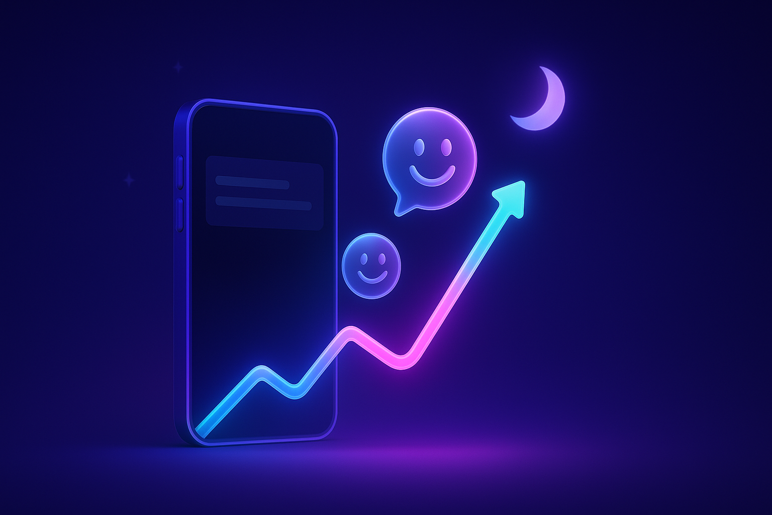
Case study (assuming): Think of the E-Learning Platform for programming After they added the Dark Mode feature. What happened was:
This success is not only from having a button to switch mode. But from the design that understands that Dark Mode is not just the color, but UX/UI, which helps customers achieve their goals better. Which is the heart of creating conversion
If you decide that Dark Mode is the right thing for your website. This is a step that should be done. In order to get good results and actually work Not just beautiful, but the picture:
Prefers-Color-Scheme. To allow the website to automatically alternate according to the operating system settings set by the operating system
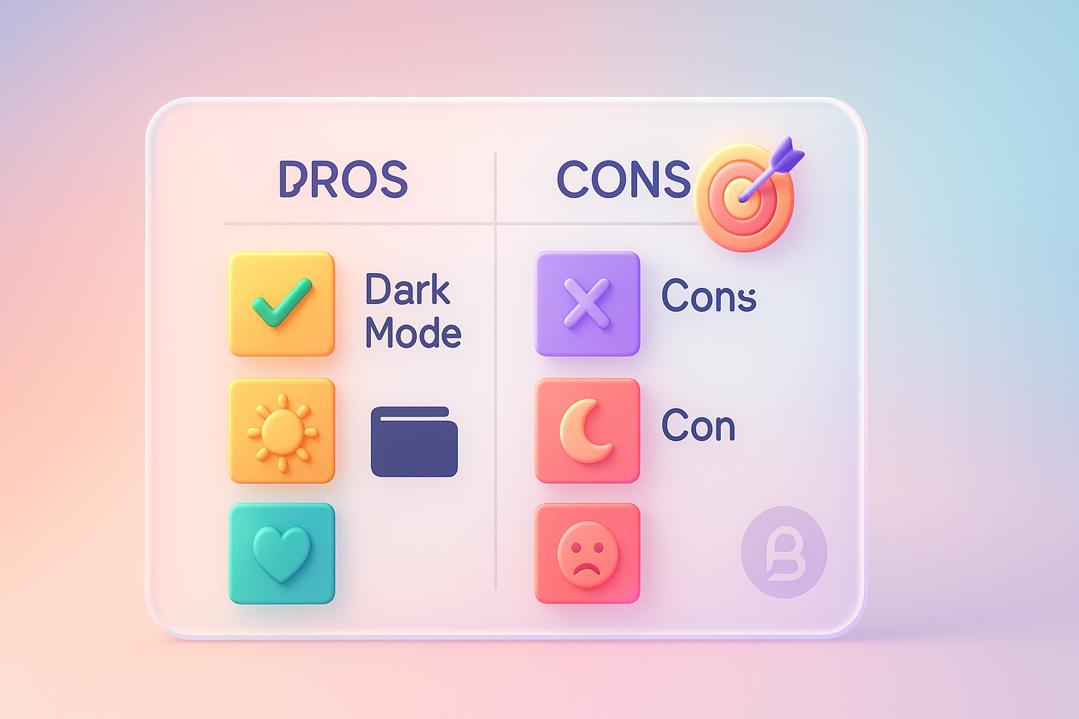
Q1: Is there a better Dark Mode?
A: There is no direct effect. Google does not give better ranks with the website with Dark Mode, but it is indirectly via UX. If your Dark Mode helps users. On the web longer (Dwell Time) or more interacting with the website (Engagement). These are good signs that have a positive effect on SEO in the long run.
Q2: All types of websites are suitable for Dark Mode?
A: Not always. Website that focuses on reading long articles, government websites, or websites that want to communicate bright, friendly, such as web, mother and children. It may not be suitable for Dark Mode. On the other hand, the technology website, entertainment (Streaming), or brands that need modern luxury, usually better with the Dark Mode.
Q3: Do you need a lot of budget to do Dark Mode?
A: Depending on the complexity of the website. If it is a newly created website and planning from the beginning The cost may not be very high. But if it is put on an old website with a complex structure (Retrofitting) may require a budget and time for design and testing. Which may be considered as part of Website Renovation (Website Renovation )
Q4: Should the website be set as a Dark Mode automatically at night?
A: It is an interesting idea. But the best way is "Do not do". We can't know what kind of user is in the environment. Giving users options via Togle is always the safest and most useful way to use users.
At this point, we have already agreed that Dark Mode is more than a beautiful trend, but it is a "powerful" to enhance the user's experience (UX). When used correctly, time and correct, the key is not that your website "Dark Mode or not, but is enough to" understand and care about your customers to give them the best experience for them or still?
Choosing to do or not to do Dark Mode should be a result of the analysis of the target group, understanding the brand's identity, and weighing the advantages and disadvantages. Not just following the trend Because in the end The successful website is a website that is easy to use, answers and creating good feelings for users. Whether in bright mode or dark mode
What about your website? Ready to present the best experience to customers? Do not let the hesitation block your business opportunities. Good investment with UX today. Is to build a strong foundation for growth in the future
If you need experts who understand deeply, both design and strategy Come to help you analyze and design the right UX/UI for your business, whether it is the perfect Light Mode or Dark Mode. Consult the Vision X Brain team. We are ready to change your website to be loved by customers and create a business result.
Before adjusting the UX, people enter the website and then get out. But when removing the new design Become the best off the sale point instead!

After re -the brand with Vision x Brain, sales x3 in 2 months!

Change the web with VISION X Brain for just a few days. New customers start to understand our business immediately.

After the Reemine and Vision X Brain, organizational customers start to book through the website themselves - do not rely on connections like before.

After changing the website with Vision x Brain, the user dares to test the system from the first page - no need to follow the call or explain again.

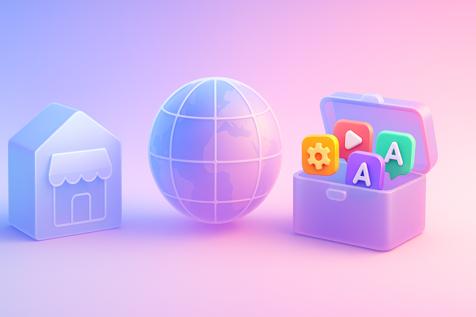
Want to sell all over the world? Compare advantages-disadvantages during the use of Shopify Markets and language translation apps. (Mulilingual Apps) to select the system that is most suitable for your store.

Add customers to rent with SEO! In -depth, SEO strategy for rental businesses, especially from Local SEO to the product page.

Stop wasting time making a reportable! Teach you how to connect to N8N with Google Looker Studio (Data Studio) to create a Dashboard and automatic marketing.