
July 4, 2025
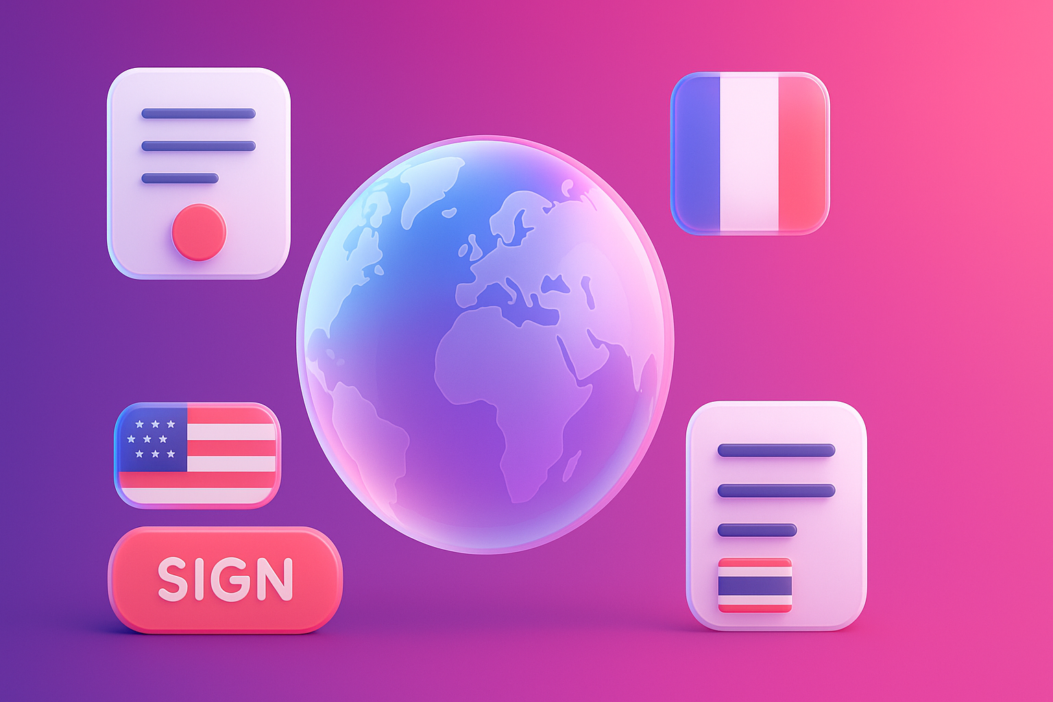
Business owners, marketing teams, and many website designers have experienced this headache situation ... We are dedicated to both physical strength and creates a beautiful website. Modern design The complete features in the eyes of Thai people, but when "Go Inter", the web to invade the international market. Whether America, Europe, or even Asian neighbors like Japan, found that "the result is not as expected"
The traffic that had previously had disappeared. The expected sales were not coming. Foreign customers come in and then turn off immediately. As if our website was "Speak in different languages" to them, even though they actually translate the content into English. This problem does not mean that your products or services are not good. But it may be "Invisible blind spots" that are hidden in UX/UI design, which is "Cultural Nuances" .
[Prompt for illustration]
The graphic images compare Thai businessmen who are confused in front of the computer. One side of the website that looks beautiful in the eyes of Thai people. But the other side is a picture of a foreign user (such as Westerners, Japanese people) that are confused, confused or ignoring the same website.
The main reason why our website "Pae" in the international market is well designed. Because we tend to trap the "beautiful design in a universal language", which in fact ... is not all Each culture is perceived, interpreted and having a completely different digital usage behavior. What looks "simple minimal" in the eyes of Westerners may look "too open, not reliable" in the eyes of Japanese people. While the design that is "full color" in Thai style may look "messy and non -professional" in the eyes of Europeans.
These factors are described by the Cultural Dimensions of Hofstedes Insights, which indicates that each nation has different ways of thinking and value:
Not understanding these dimensions Is the reason why our UX/UI goes to "displease" foreign users without knowing it
[Prompt for illustration]
Simple infographic images showing 2 sides of the diagram. One side is the topic of "Low-Context Cultures (EG, USA, Germany" with a simple web design icon. There are direct messages (such as "Buy now" on the other side, "High-Context Cultures (EG, Japan)" with a web design icon with more information. With images and symbols to communicate
Ignoring cultural differences in website design Not just causing you to "lose sales" in the target market But it affects the chain that is much more scary:
In the end, letting this problem unfold. Is like rowing to deliver products to foreign customers But instead parked wrongly Causing customers to not be able to pick up things
[Prompt for illustration]
3 comparison images: 1. Wasted ad spend. 2. Damaged Brand 3.
The key to unlocking this problem is "Localize" or UX/UI adjustment to the local context, not just "Translate" or translating only one language. Which we can start adjusting from these important elements:
Starting from research and understanding the behavior of people in the target Is the first step that is the most important to create the right UX/UI and can actually create a conversion
[Prompt for illustration]
4 comparison tables (Layout, Color, Imagery, Language) between two different cultures, such as "Western Design" VS "East Asian Design" with examples of small icons.
In order to be clearer Think of the Thai fashion clothing brand that wants to expand the market to the United States and Japan at the same time. If using a single design website (Designed for Thai people) The result is probably not good. But if they adjust the UX/UI to each market, especially The results will be completely different.
Mission to conquer the American market (Individualism & Low-centtext):
Mission to conquer the Japanese market (Collectivism & High Unclertainty Avoidance):
By changing the UX/UI according to the design principles that understand this deep customer . The brand's website will be able to communicate and create trust with both markets that are different, resulting in significantly increased conversion rate.
[Prompt for illustration]
The picture of the BEFORE & AFTER is divided into the left-screen. The left is "One-Size-Fits -all Website" that doesn't match anyone. The right side is divided into two small parts. "Optimized for USA" (minimal design) and "Optimized for Japan" (the design has a lot of information and cute).
Read here You would like to start adjusting your website and try using this 5 Simple checklist as a guideline.
[Prompt for illustration]
Checklist images with 5 icons arranged down: 1. Define Market. 2. Research 3
Q: Is it necessary to create a whole new website for all countries?
Answer: Not always necessary! For starting You can use one domain and divide the structure according to language, such as using subdirectories (yourbrand.com/jp/) or subdomains (jp.yourbrand.com). The platform like webflow can support multiple content management quite flexible. Choosing the right method depends on your SEO strategy and your management.
Question: Minimalist design is considered a universal design that can be used in all countries, isn't it?
Answer: It is an understanding that is easy to move. Although the minimal design is very popular in the Western world. But in many Asian or Middle East Users expect a lot of information to make a web decision that looks too "open" may be seen as "No information" or "unreliable". Therefore, the suitability depends mainly on the expectations of the target market.
Question: Using a stock photo that is a variety of people will help solve this problem?
Answer: It's a good way to create a universal brand image. But if you want to "drill" any market seriously Using pictures of local people in that country (Localization) will create a feeling of connection and friendly. (Reelatability) is clearly better.
Question: During the design and translation What should be given first?
Answer: Should be done at the same time, because both of them are indistinguishable. The translation of the lonely language, but on the design that displeases the user, it does not cause conversion. On the other hand, the design is well adjusted but uses the translation from a distorted tool. Also destroy the reliability. Therefore, Localization must consider both UX/UI and the language at the same time.
[Prompt for illustration]
Large question icon image And there are small bubbles surrounded by each bubble, which has small answers, such as a ball icon that has / JP / final, a minimal web vs web site, a lot of local image icons.
Creating a successful website in the world market The key is not the design that is "most beautiful" in our eyes, but it is in the creation of the "yes" experience in the eyes of customers in each culture. Overlooking cultural differences is like standing on the stage. But use the language that no one understands
Today, we have seen that from layout, color, pictures, to language, all affect the perception and trust of foreign users. Investment is effective to study and change the UX/UI to the context of each locality. (Localization) is not a "cost" but the most important "investment" That will help your brand be accepted to create sales and grow in the world stage sustainably.
It's time to change your view from creating a web. "One-Size-Fits -all" to create a website that can "Speak the same language as customers" anywhere you visit What about your website? Ready to overcome cultural walls yet?
Want Vision X Brain to help you analyze and design UX/UI that understand cultural differences. To unlock business potential in the world market, right? Consult our experts for free immediately! We are ready to be a partner to help your brand be loved in every market.
[Prompt for illustration]
Powerful last picture Is a hand image of many races, protruding hands in the middle With a bright backdrop Convey the success of business connection
Before adjusting the UX, people enter the website and then get out. But when removing the new design Become the best off the sale point instead!

After re -the brand with Vision x Brain, sales x3 in 2 months!

Change the web with VISION X Brain for just a few days. New customers start to understand our business immediately.

After the Reemine and Vision X Brain, organizational customers start to book through the website themselves - do not rely on connections like before.

After changing the website with Vision x Brain, the user dares to test the system from the first page - no need to follow the call or explain again.

Want to sell all over the world? Compare advantages-disadvantages during the use of Shopify Markets and language translation apps. (Mulilingual Apps) to select the system that is most suitable for your store.

Add customers to rent with SEO! In -depth, SEO strategy for rental businesses, especially from Local SEO to the product page.

Stop wasting time making a reportable! Teach you how to connect to N8N with Google Looker Studio (Data Studio) to create a Dashboard and automatic marketing.