
Juy 13, 2025
Have you ever felt like this? Your B2B business website is well designed, beautiful, modern, product information or service is fully put. While also spending a budget for people to enter the web every day But ... why is it so lonely? "Request a quotation" or "Demo" is almost zero. The visitors stopped like the train station. Well, then continue Not a business conversation once
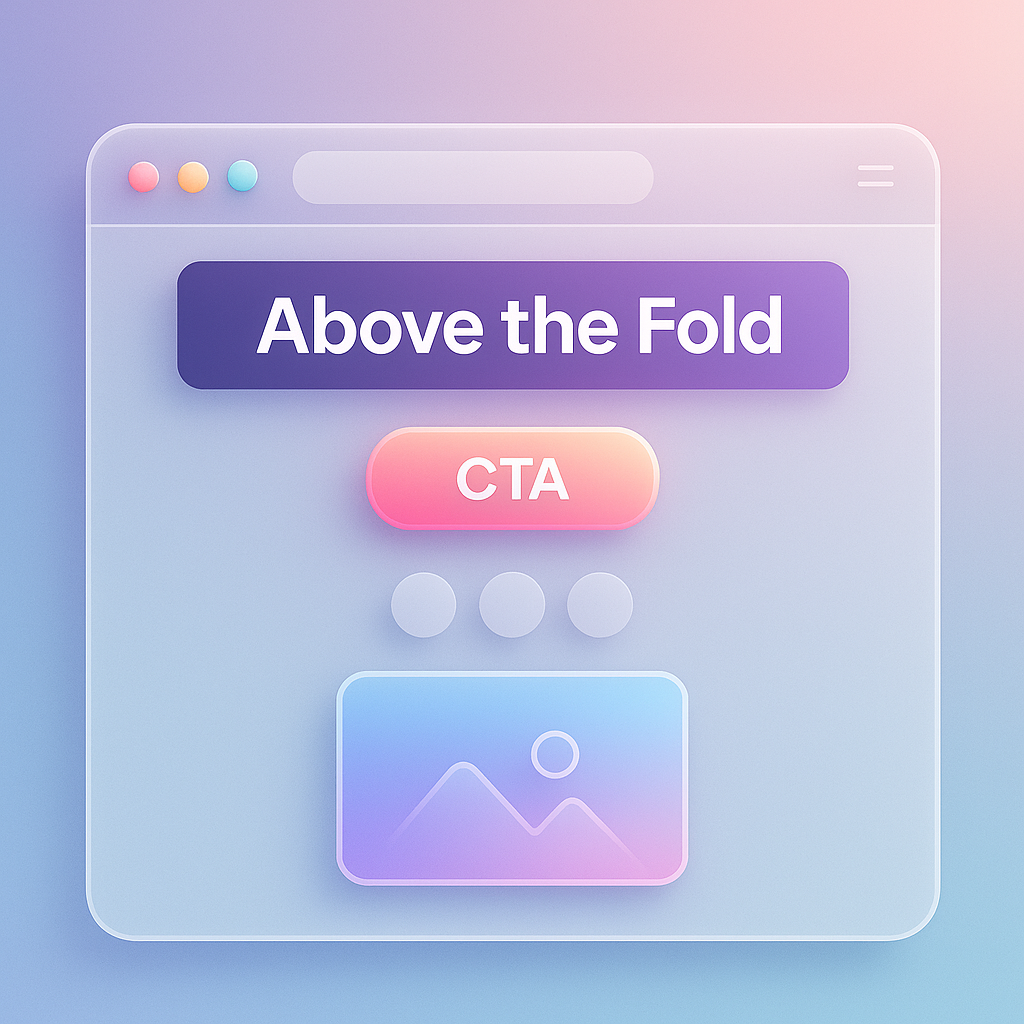
If you are encountering the situation, "The traffic has only Lead." This is not to face this problem alone. This is the classic symptoms of the website that missed the "golden opportunity in the first 5 seconds" unfortunately. The area called "Above The Fold" or the first part of the screen that the user saw without having to scroll down. Is the battlefield to judge the most important fate And your website may be defeated in this battlefield.
Prompt for illustrations: Split-Screen compared to the left side as a picture of a person looking at the computer screen with confusion, headache with the right side as a person with a satisfactory smile while using the same website, but the new design. There is a distinctive message that "5 seconds to judge your business future"
The reason that the ABOVE The Fold of many B2B websites work is not fully effective. Not because the design is not beautiful But because it is "communication" is not good enough. Most problems are caused by these misunderstandings:
Research from UX experts like the Nielsen Norman Group confirmed for many years that Although scrolling behavior is normal But the information that the user is interested will decrease gently when scrolling down. This means that the Above The Fold area is still the "most expensive real estate" on your webpage.
Prompt for illustrations: simple infographic images Show the brain of the customer with a question mark (?) While looking at the ABOVE THE FOLD, the website is full of technical terms and does not have a clear CTA button.
Having a weak Above The Fold is not just about losing opportunities, but it is a "cost" that your business is paying every day without knowing it. The consequences are more intense than expected:
Prompt for illustrations: The silver picture is floating from the computer screen that opens the B2B website that looks confused, with a bounce rate graph.
The good news is that this problem can be resolved. And do not have to even have to dismantle all the new websites We just adjust the "5 important elements" in the ABOVE THE FOLD section to be clear and work together efficiently. You can change the visitor to the customer immediately.
The main principle is to answer 3 questions of the visitors within 5 seconds: "Where is this?", "What is there for me?" And "What should I do next?"
The perfect combination of these elements is the heart of conversion optimization that will truly change the game for your B2B website.
Prompt for illustrations: beautiful infographic shows the layout of the ABOVE THE FOLD, with 1-5 points to each part (Headline, Sub-Headline, Visual, CTA, Trust Signals) with a short explanation.
How good theory Not as much as you see the real thing Let's see how the world -class B2B company uses 5 elements above to create powerful ABOVE The Fold.
1. Asana:
- Headline: "Work on Big Ideas, without the Busywork." (Big work Without having to be busy with the work) - clearly communicate the results Is to reduce unnecessary work.
- Sub -Headline: " From the Small Stuff to the Big Picture, Asana
Organizes Work So Teams Know what to Do, Why IT Matters, and How to Get IT
Done . " "Get Started", clear black button
- Social Proof: World -class customers like Amazon, Google, Deloitte under
2. Shopify:
- Headline: "The Global Commerce Platform" (trade platform for worldwide) - How clear is it?
- SUB -Headline: "Build your business with a platform that Helps, online, online, and eyewhere in Between. " - Expanding the ability
- Visual: The picture of the shop that looks good and successful
- CTA: " Start Free Trial ", big green button, seen from Kla
- Social Proof: stated that" Trusted by Millions of Businesses Worldwide. "
3. Slack:
- Headline: "Move Faster with Your Tools in One Place" (work faster With all the tools in one place) - focus on "speed", which is what every business needs
- SUB -Headline: "Automate Away Routine Tasks and Focus on What Matters Most." - Expanding the benefits
- Visual: The program that shows the app that works with other apps
- CTA: There are 2 clear buttons. Choose according to the needs
- Social Proof: Logo, many leading customers
4. Hubspot:
- Headline : "
A Powerful Crm Platform That's Easy to use" (Easy CRM CRM) - Slap the competitors that are often difficult to use
. Marketing, Sales, Content Management, and Customer Service. " - Tell the completeness - Visual: The overall Dashboard that looks clean and easy to understand
- CTA: " Get A Demo "and" Get Started Free "
- Social Proof: Available numbers, users and cocoes
5. Caterpillar (CAT):
- Headline: )
- Communicate the strength and necessary in the heavy industry.
- Sub -headline: No, but use the picture to tell the story . Reflecting power and reliable This is an example of Landing Page design for excellent
- CTA: "Explore Products & Services" and "Find A Dealer" clearly
- Social Proof: The brand Caterpillar itself is the strongest Social Proof.
Prompt for illustrations: Collage images that include the Screenshot. The ABOVE THE FOLD of all 5 websites are beautifully arranged.
Ready to improve your website, right? Try to follow the 6 -step Checklist.
Understanding that "What to say" in order for organization customers to believe Is the key Try reading more. How to write pages 'Why do you have to choose us' to polish your values to make it sharp?
Prompt for illustrations: Beautiful checklist images with each icon (target, brain, mouse button, picture, logo, draft paper)
Question: "Above the Fold" is still important? In this day and everyone Then scroll all the screens to watch the web?
Answer: More important! As mentioned above It is the decision that the visitor "Will you waste your time to scroll down to watch?" If the first 5 seconds, you can't make him interested. He will press off immediately without postponing anywhere. Try reading in -depth analysis here: Above the Fold is still important?
Question: How many CTA buttons should be had in the ABOVE THE FOLD section?
Answer: The best rule is "with the most prominent Primary Cta button" and may have "Secondary Cta" that is less prominent (such as using a link. Or translucent buttons). Can be placed near each other, such as the main button is "Democrats" (solid color) and the secondary button is "watch video" (airy) for options. But not confusing
Question: For the B2B website, should it be better to use photos or pictures from Stock Photo?
Answer: Real photos of the team, office, or your products that are taken professionally. Will always build credibility and bond better than stock images Because it shows real identity But if it is necessary to use stock images Choose to invest with high quality images that look natural and convey the "results" that customers will receive. Not a picture of a foreigner smiling in a fake meeting room
Question: We are a small company. There is no famous customer logo to show. What should I do?
Answer: It's okay! You can use Social Proof in other ways, such as testimonial or compliments from customers. (Request permission first) to show with his name and company, show the Case Case Study, which says that you help the customer to solve any problems and get better results, or show the number of successful projects. These things create good credibility, not inferior to the logo.
Prompt for illustrations: Large question mark icon (?) With Bóng đèn (light bulb) that is bright beside Conveys a clear answer
In summary, "The first checkpoint" or the ABOVE The Fold of your B2B website will have to act like the best receptionist. Is able to tell the whole story of your business within 5 seconds with 5 important components: sharp headline, clear sub-headline, powerful Visual, navigation CTA and Social Proof that ensure
The investment is to improve the small space. This is one of the most worthwhile investments that you can do for your business. It can change the fate of the website from just "beautiful online brochure" to become a "LEAD creation tool and close the sales at work for you 24 hours."
Now ... Try opening your website. And only look at the part that does not have to scroll the screen Ask yourself honestly that "If I am the customer who came in for the first time Will I understand in 5 seconds? And what should I do next? "
If the answer is "no" or "not sure" ... It's time to change!
If you want a professional team that has experience in creating a webpage that can actually change to customers, consider the UX/UI design and Landing Page design service that focuses on our highest conversion. We are ready to give advice to find the best solution for your business.
Prompt for illustrations: People are pointing to the "Request A Demo" button on the computer screen with confidence smiles. The back is a conversion graph that is soaring.
Before adjusting the UX, people enter the website and then get out. But when removing the new design Become the best off the sale point instead!

After re -the brand with Vision x Brain, sales x3 in 2 months!

Change the web with VISION X Brain for just a few days. New customers start to understand our business immediately.

After the Reemine and Vision X Brain, organizational customers start to book through the website themselves - do not rely on connections like before.

After changing the website with Vision x Brain, the user dares to test the system from the first page - no need to follow the call or explain again.


Add customers to rent with SEO! In -depth, SEO strategy for rental businesses, especially from Local SEO to the product page.

Stop wasting time making a reportable! Teach you how to connect to N8N with Google Looker Studio (Data Studio) to create a Dashboard and automatic marketing.

Make the user "smell" the desired information! Learn the principle of "Information Scent" to design the Navigation and UX that guides users to the goal and add conversion.