
June 14, 2025

For the Founder or the SAAS STARTUP market, everyone would be more hurt than dedicating the physical, insight, creating a product that is believed to be "good". There is a beautiful modern design website. But after launching ... found that the new user graph (Sign up) is "calm" as if nothing happened.
You may be faced with this situation: Someone has access to the website from shooting or doing SEO, but they just "come to see" and "click to close". The number Rate is high, the rate of change from the visitor is low. The marketing budget that went down was like pouring water into the sand. This is a nightmare that is true of many Saas businesses and it is the beginning of this case.

This problem is not caused by your product badly. Or the team is not good But often, it is caused by the "gap" between what "We think that users want" with what "users really want", which often comes from the following main causes:
All of this is the blind spot that makes your website become just "Beautiful online brochure" but not "tool to grow" for the business as it should be Understanding Guidelines for creating SAAS for growth Is an important first step in solving this problem

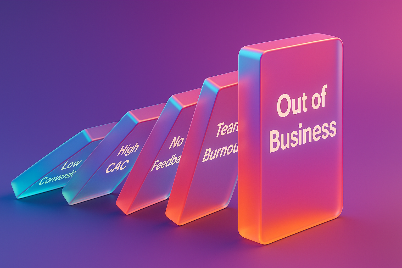
Having a low conversion rate is not just about "Unattractive numbers", but it is the beginning of the "Downward Spiral" that affects the whole company in the long run:
In the end, if this problem is not resolved It may lead to the most dangerous point for Startup. That is "running out of capital" before finding the true product-market fit.
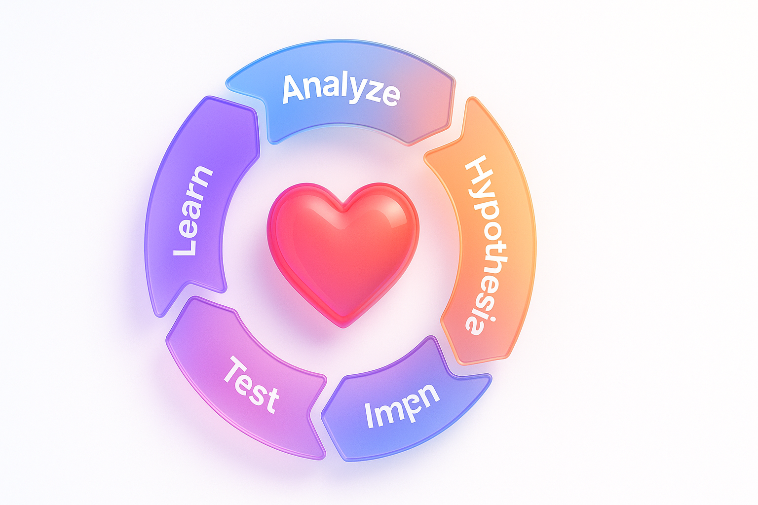
The solution from this circuit is to change the focus from "Guess the user" as a "understanding of users" through real information The most powerful weapon in this story is the collaboration of Conversion Rate Optimization (Cro) and User Experience (UX) .
Simply put,:
And where should it start?
This process is not a single done. But is a circuit that keeps repeating To improve the website all the time For anyone who wants to see other cases, CXL is a good learning source that has many Case Study about SAAS , and if you need experts to help take care of this process, the Conversion Rate Optimization service by experts. It is another option that helps save time and create results quickly.
In order to clearly see the case, we would like to raise the case study of "Appsynth.AI" (assumed name), which is a Saas Startup, which has a product for creating automatic marketing. They encountered a classic problem. "The website is beautiful but no applicant"
The condition before the improvement (The "before"):
Cro + UX (The "Process"):
We have fully adopted the SAAS website to apply on this project.
The results after improvement (The "After"):
After releasing the new version and measuring results for 3 months, the result is:

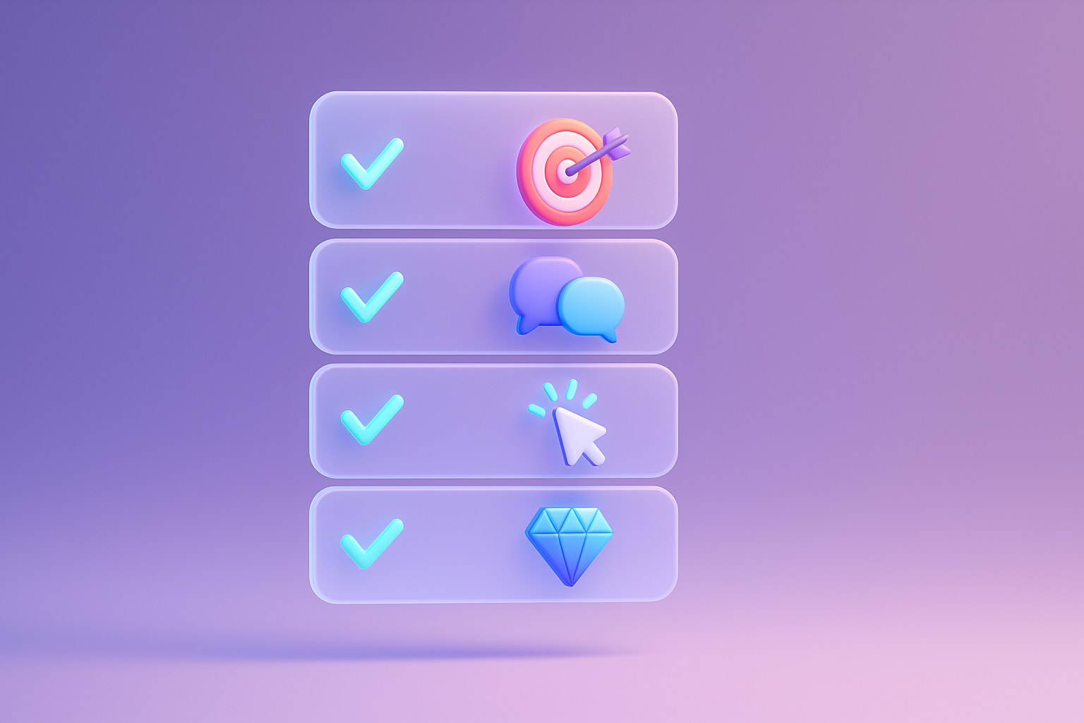
From the success of this Case Study, you can apply the principles immediately. Let's start with this 5 checklist:
To follow these steps Is to start Startup website that focuses on true
Q1: Do you have to use a lot of budget?
A: Not always necessary! You can start with free tools such as Google Analytics, Google Optimize (for A/B Test), and Microsoft Clarity (for Heatmap). The key is at "Thinking process" and "Doing" more than expensive tools
Q2: How long does it take to see results?
A: Small Tweak, such as changing the text on the CTA button may see results within 1-2 weeks, but the structural changes may take 1-3 months to measure clearly. The important thing is consistency. Cro is a marathon. Not 100 meters running
Q3: Should we do SEO or Cro first?
A: It's a very good question! The answer is that it works together like a partner. SEO is "calling customers to the store" Cro is "change the customer in front of the store to buy." If you have some traffic, then the CRO to leak will help your SEO budget to be enormous. But if the website doesn't have a traffic at all
Q4: A/B Testing, is it necessary to do it every time?
A: For big changes The risk of making A/B Testing is considered Best Practice to confirm the hypothesis with real data and prevent the changes worse. But if it is a correction point that is wrong (such as a loss link, the button cannot be resolved without testing for beginners. The basic learning of A/B Testing is a very useful skill. If you need more ideas Growthhackers It is a good source of techniques for growing .

Case Study of "Appsynth.Ai" has proven that adding a sign up to the SAAS website. Not from magic or enormous advertising budget But from the return of the fundamental thing, that is "your user"
The combination of the art of understanding (UX) with scientific processes for non -stop development (Cro) is the key to unlock the hidden potential of your website. It is a web change that used to be just "Beautiful online brochure" to become a "Growth Engine" that works for you 24 hours a day.
Don't let the beautiful website You must be lonely anymore. It's time to "listen" what users try to tell you through their behavior and "do" to create the best experience for them to come back.
Today ... You are ready to change. "Visitors" to become a "real user"? Start checking your website with the 5 checklist that we provided! Doing a little today It may be the beginning of the 500% growth in the next day.
If you are looking for a partner to help you Create and develop Saas websites that are not just beautiful. But focusing on creating sustainable business growth Our team is ready to give a free consultation! Can contact us

Before adjusting the UX, people enter the website and then get out. But when removing the new design Become the best off the sale point instead!

After re -the brand with Vision x Brain, sales x3 in 2 months!

Change the web with VISION X Brain for just a few days. New customers start to understand our business immediately.

After the Reemine and Vision X Brain, organizational customers start to book through the website themselves - do not rely on connections like before.

After changing the website with Vision x Brain, the user dares to test the system from the first page - no need to follow the call or explain again.


Add customers to rent with SEO! In -depth, SEO strategy for rental businesses, especially from Local SEO to the product page.

Stop wasting time making a reportable! Teach you how to connect to N8N with Google Looker Studio (Data Studio) to create a Dashboard and automatic marketing.

Make the user "smell" the desired information! Learn the principle of "Information Scent" to design the Navigation and UX that guides users to the goal and add conversion.