
July 6, 2025
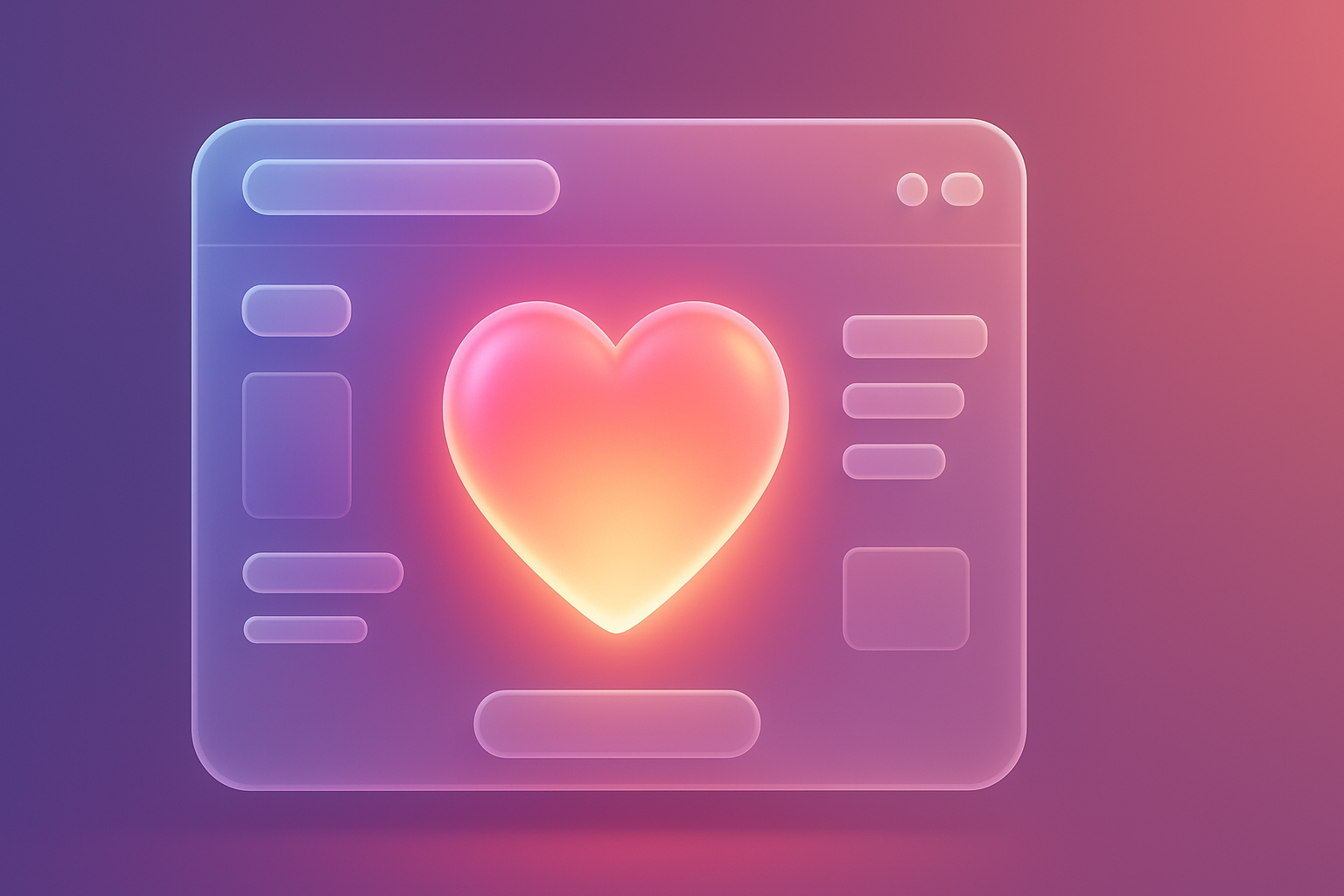
Have you ever felt like this? You dedicated both money and time to create a beautiful website. Complete function The design is also modern. But the result was disappointing ... The amount of users does not increase. The rate of reuse is small. Customers come in and go quietly. Like just stop by to say hello and then passed This problem is not to you alone. But it is a true story that many web people are facing We tend to be obsessed with "Aesthetics" and "Usability" until the most important dimension is the "Emotion) of users. The "heart" website is no different from the robot that works as ordered. But cannot make any impressions or bonds at all
-[Prompt]-
PROMPT for illustrations: The comparison image between the website A looks beautiful but lively with the website B, which has a simpler design, but there are elements that make the user smile (such as a cute Mascot or a friendly greeting message) with the graph that shows the Engagement A, the stable and the B -website.
-[/Prompt]-
This problem arises because we tend to look at the web design as just "Logical and reasoning". We create the shortest user flow, put the button to find the most easy to find, use the most contrast colors. But all is the only logic response (Logic) We forgot that humans decided and created most memories with "emotions". According to Don Norman principles, the pioneer of User Experience explained in the famous Emotional Design that there are 3 levels of human perception: Visceral (instincts), Behaviral (behavior) and Reflective. BEHAVIRAL is "easy to use" but the exam fails to the Visceral level that must be "beautiful at first sight" and the level of Reflective that must "create good memories and meaning" for users that we focus on the function but lack emotional connection. Is like building a strong house but no one wants to stay Because it does not give the feeling of the word "house". The ignorance of the user's emotions is the root of the problem that makes our website only "tools" but not "friends" that users think of
-[Prompt]-
Prompt for illustrations: simple infographic images The human brain is divided into 2 parts: "Logic" (with a gear -shaped icon, graph) and "Emotion" (with heart -shaped icons, stars, smiling faces) with the arrows that most designs focus on the logic, but the arrows that point to Emotion is empty.
-[/Prompt]-
If we continue to let our website be just a beautiful but exposed area The consequences were more serious than just "Sales are not bang", but it is a long -term corrosion brand. Imagine:
Ignoring Emotional Design is like you try to add water to the leak. You may be able to get a lot of marketing budgets to draw people in. But in the end, they will flow out completely Because your website "Their feelings" can't keep their good ". Understanding The impact of the organization website on brand Will help you see the image more clearly why this matter is extremely important
-[Prompt]-
Prompt for illustrations: Before/After comparative images. The first side is a water tank with many holes. The water flowed almost completely. (It is like a customer that has passed away). The After side is a water tank that has been leaked with heart -shaped icons. And has a full tank (Like customers who are still with the brand)
-[/Prompt]-
The good news is ... We can wake up our hearts for our website to be lively! And the best starting point is to understand and apply the 3 levels of Don Norman's Emotional Design at Interaction Design Foundation. Let's see what each level is and where we can start:
The perfect design is to combine all 3 levels together. To create experiences that are not just "satisfactory" but it is a memorable ". If you need experts to help place strategies in this section, UX/UI design service is ready to give advice.
-[Prompt]-
Prompt for illustrations: 3 layers of pyramid pyramid, the bottom floor is "Visceral" (eye -shaped icon), the middle layer is "BehaVIoral" (hand -shaped icon, use) and the top floor is "Reflective" (the brain -shaped icon, the meaning/story) with short explanations in each layer.
-[/Prompt]-
If talking about the example of a company that uses Emotional Design, it becomes a legend of "Mailchimp". It must be first. Mailchimp is a platform for email marketing, which is a "boring" and "full technique, but they can make it" fun "and" friendly.
Starting problem: Email campaign is stressful and worried for marketers. You have to check and check again. Afraid to send mistakes And hope that the results will come out well
How to fix with Emotional Design: mailchimp understands this feeling well. And they designed the experience at all levels to change stress into happiness:
Results: Investment in Emotional Design makes mailchimp not just a "tool" but becomes a "partner friend" of the worldwide marketers. Until growing into billions of dollars This is the power of design that truly understands the "heart" of the user.
-[Prompt]-
Prompt for illustrations: Mailchimp screen model with Freddie Mascoting Freddie is fun acting (such as high -five) after some users work. With a graph showing the satisfaction of the customer (Customer Satisfaction)
-[/Prompt]-
Would like to try to apply Emotional Design to your website But don't know how to start? Don't worry! Try using this simple checklist. Can be divided into 3 levels so you can do it immediately.
Step 1: Modify "Visceral Level"
Step 2: Create an experience that "Behavioral Level"
Step 3: Relationship "Reflective Level"
Just start these checklist one by one. Your website will begin to have a "heart" and create better bond with users.
-[Prompt]-
Prompt for illustrations: Large checklist images that look beautiful and easy to use. With 3 main topics, Visceral, Behavioral, Reflective and has a cute icon Assembled in each item
-[/Prompt]-
We have compiled a question that many people wondered about Emotional Design with clear answers and easy to understand here.
Q: Emotional Design is suitable for every business? Or only suitable for the brand of lifestyle products?
Answer: Suitable for every business! Whether you sell B2B software, financial services, or consumer goods Your user is still a "human" who has feelings. Creating positive feelings such as reliability, safety, feelings of care All are important for every business. The design that understands the emotions will always help make the differences and advantages in the competition.
Question: If we have a limited budget Should start investing with Emotional Design first?
Answer: Start with small things. That can make a lot of impact Also known as "Low-Hinging Fruit", such as
1. UX Writing: Improve the text in the button (CTA), topic, and error messee to be more friendly and understand. This part uses the least cost but see results.
2. Micro-inverttions: Add a little animation when pressing the button or loading the webpage. To make the usage look more lively.
3. Picture: Selecting or taking the main image (Hero Image) that will be used on the first page. Because it is the first thing that users see and impress immediately
Question: How can we measure the success of Emotional Design?
Answer: Even "feelings" are difficult to measure. But we can measure through the changes of users, such as
- Time on Page (when used on the webpage): If the user feels enjoyable He will be on the web longer
- Pages Per Session (the number of openings per time): Good feelings will encourage them to explore your website more
- Conversion Rate (concentration rate): Positive trust and feelings directly to buy or contact
- Brand Mentions (Speaking of brands): Notice in social media. That someone is talking about good experiences On your website?
- Customer Satisfaction Surveys (Survey of satisfaction): Add questions about "feelings" to use in the survey.
-[Prompt]-
Prompt for illustrations: Large question mark icon (?) Surrounded by a small icon That conveys various questions such as budget, measurement, business type
-[/Prompt]-
At this point, I believe that everyone will see the same picture that Successful website design in this era Cannot focus on "beauty" or "ease" anymore, but must go down to the creation "Good feelings" to happen in the minds of users. We have learned the 3 levels of Don Norman from Visceral (instinct), Behavioral (behavior), to reflective (reflection), which is an important green print to create a complete and memorable experience.
Investment with Emotional Design is not just a web decoration to look good. But it is an investment to create "Relationships" in the long run, it is a change from "visitors" to "fans" and change from "brand" to become a "friend" that users think and trust. Don't let your website be just a code and a lively pixel.
It's time to wake your heart for your website! Try to use the checklist that we give to use little by little. I guarantee that you will definitely start to see the changes. Start today To create a website that your user will "love", not just "use"! If you need a professional team to help create a website that is both beautiful and understanding the heart of users Consult the Vision X Brain UX/UI design team for free! We are ready to be a partner and create impressive results for your business.
-[Prompt]-
Prompt for illustrations: Powerful graphics Showing the hand of the designer, changing the sketch of the website (Wireframe) in a lifeless line to become a colorful website and a heart -shaped icon floating out. Conveying normal websites into a lively website
-[/Prompt]-
Before adjusting the UX, people enter the website and then get out. But when removing the new design Become the best off the sale point instead!

After re -the brand with Vision x Brain, sales x3 in 2 months!

Change the web with VISION X Brain for just a few days. New customers start to understand our business immediately.

After the Reemine and Vision X Brain, organizational customers start to book through the website themselves - do not rely on connections like before.

After changing the website with Vision x Brain, the user dares to test the system from the first page - no need to follow the call or explain again.

Want to sell all over the world? Compare advantages-disadvantages during the use of Shopify Markets and language translation apps. (Mulilingual Apps) to select the system that is most suitable for your store.

Add customers to rent with SEO! In -depth, SEO strategy for rental businesses, especially from Local SEO to the product page.

Stop wasting time making a reportable! Teach you how to connect to N8N with Google Looker Studio (Data Studio) to create a Dashboard and automatic marketing.