
July 17, 2025
.png)
Have you ever felt like this? You are dedicated to creating a beautiful company website with an attractive home page. There is a page/service page that is complete. But when clicking on the 'About US' page (about us) or 'Why US' (why choose us), the atmosphere has changed immediately ... it becomes like a storage room full of a company history that has never wanted to read, mission/vision. That looks elegant but does not reach Or a list of executives that customers do not feel linked at all
Finally, when you try to open Google Analytics, you find pain. Pain: These faces have high bounce rates (return rates) and Time on Page (time spent) low on the ground. It becomes a 'tons' page that customers stop by ... and then press off without off. This is a classic problem that makes beautiful websites. Many websites have to lose the opportunity to "close sales" unfortunately.
Prompt for illustrations: Compare images of the About US page. One side is a boring long text. The other side is a picture of a lively team with interesting storytelling.
The main reason why About US and WHY US page fail Not because it's "not beautiful" or "too little information" but because we are "Tell the wrong story." We often write it up from the perspective of "company" by trying to say that "How cool we are" "When did we established?" Or "What are we receiving?" All of this is "us" (us).
But in reality Customers who click into this page He has only one question in his heart: "What is it about me? (What's in it for me?) "
They do not want to know the world history. But he wants to know that your "story" will help "solve problems" or make the life of "him" better. The problem is caused by us:
Prompt for illustrations: simple infographic images Showing a view from "We-Focused" (big company picture) to "You-Focused" (the customer smiles are happy)
Having a boring and unhealthy About US page, not just "losing space" on the website, but it has a negative impact on the business in the long term than expected:
1. Destroy Customer Journey: Customers may be interested in your products. But after wanting to know more about you and found a disappointing About US page The linkage and confidence that is forming may "collapse" immediately. It is like a beautiful dating. But the other party only told his own story to be boring
2. Loss of opportunities to make differences: in a highly competitive market Products and prices may be similar, but the "story" and "identity" of the brand is what makes you different. If your About US page is like 10 more competitors, you are no different from the "dozen" in the customer's eyes.
3. Reduce reliability: good About US page and represents humanity. Will create a feeling that "Behind this company, there are real people who care." But if there are only official and lively messages It will make the customer feel that the deal is with an unlucky and difficult company. This is undermine enormous credibility on the website
4. Miss the opportunity to close the sale: About US page is the best stage to change from "seller" to "experts who want to help" if you do well. Customers will decide to buy from you. "Because he believes in your identity." But if you let this opportunity go It means that you are forced you to judge you from "price" only.
Prompt for illustrations: Customer Journey, which is about to reach the conversion (buying), but there is a "Ton" sign that is written "Boring About US".
Solving this problem is easier than I think. Just we have to "turn the switch" in the brain from trying to "Presentation" to the "storytelling" that has a center of customers. The main principle is to answer the customer's question that "Why should I care about your story?"
This is a guideline that you can start immediately:
The best starting point is to answer the question that "If customers can only remember 3 things about our company from this page What do we want him to remember? " The answer will be the main axis of creating the ABOUT US and WHY US page that is powerful and confident in accordance with the conversionxl principles. Trust Signals.
Prompt for illustrations: Infographic images showing the perfect About US page (Why, Story, Team, Social Proof, CTA)
Imagine There are 2 online coffee shops shops. A has an About US page that says "We are the importers of high quality coffee equipment in 2015. There are over 500 products" with a large warehouse.
While the shop B has an About US page that tells the story that "Our story starts with 'Boy', the young barista who is fascinated with the Darop coffee. But frustrated to buy good equipment At a tangible price in Thailand at all He then began to travel around the world to select the best equipment by himself. Try every piece until confident. And build this shop to share 'Happiness behind the coffee cup' for all coffee lovers "with a picture of Boy, who is drip the coffee happily. And reviews from customers who say "Get good things, like having a brother who is a barista to choose"
Which store do you feel more?
This is a case that actually happened to our customers who do SME's business. After adjusting the About US page from the shop A is a shop B. The result is:
This is the power of changing "data" to be a "link" that is tangible. Which is the heart of the Case Study that is worth following and applied to the About US page perfectly
Prompt for illustrations: Comparison of the About US page of the first 2 coffee shops The second type looks warm, has a story and has a friendly shop owner.
Ready to change your About US page? You don't have to think a lot! Try to follow the checklist 5 steps:
Step 1: Find your "story" (Find Your Origin Story)
Pick up the pen paper. And answer these questions:
Step 2: Structure "Hero's Journey Structure"
tells your story, with "customers" as the hero and "Khun" as the guide:
Step 3: "Show" is not just "tell" (Show, Don't Tell)
Step 4: Reinforcing the Build Undenible Trust
Step 5: Clearly tell what to do (Clear Call-to-Action)
after building a full confidence. Do not let the customer bend! Put a clear button or link like:
Prompt for illustrations: a large checklist image summarizing 5 steps with each steps that are easy to understand.
Q: It is necessary to separate the 'About US' and 'WHY US' page?
Answer: Not always necessary! For most businesses, especially SMEs, you can combine the ideas of both pages on the 'About US' page only. By using the story (About US) to answer the question of why customers should choose you (Why US), but if you are a large organization with many aspects that have to communicate The separation of the face may help to organize the information better.
Question: The company has just opened. There is no long history or any award. How to write?
Answer: Excellent! This is your golden opportunity that will not be attached to the same format. Focus on "future" and "commitment" instead of "past" telling the "passion" story of the founder, the problem that wants to solve all the heart, and "vision" that you have to customers and industries. Freshness and sincerity are the charm of big brands. Difficult to imitate
Question: How long should you write?
Answer: There are no fixed rules. The principle is "as long as necessary. But not boring and boring " "Interesting" and "Easy to read". Use short paragraphs, with sub -topics, use images and bullet points to divide various parts. So that people can sweep their eyes to read and capture the importance quickly
Question: What kind of team photos are you using? Between the Thai suit and a casual picture?
Answer: Choose the "reflecting the corporate culture and match your customer" the most. If you are a legal company or financial advisor Belief and official images may be appropriate. But if you are a Creative Agency or a tech startup A picture that looks relaxed, friendly and showing creativity may be linked to customers better. The key is "Authenticity".
Prompt for illustrations: Large question mark icon (?) Surrounded by small icons. That conveys each question (clock, trophy, ruler, shirt)
At this point, I hope you look at the 'About US' and 'WHY US'. With changes, it is not just "that must have" according to tradition, but it is a powerful "powerful asset", the "Stage" that will make a difference and "quiet seller" that works for you 24 hours a day.
The most important heart is to change focus from "My story" is "how is our story going to help you?" Tells the story that comes with sincerity, showing the faces and hearts of the people behind, creating a tangible trust. And ending with a clear invitation for customers to travel with you
Do not let the webpage have this high potential. Became just a forgotten information anymore. Try to use the checklist in this article to apply. I guarantee that you will definitely see changes.
Ready to change the page 'About us' that is boring to become Is it a powerful 'tool for sale'?
If you need an expert who understands both Storytelling and Conversion to help you create a website that is not just beautiful. But can still sell the goods, try to see organization website development service , or if wanting to delve into the design of user experience, especially UX/UI design , ready to give advice to change every click to have meaning and create sales for you!
Before adjusting the UX, people enter the website and then get out. But when removing the new design Become the best off the sale point instead!

After re -the brand with Vision x Brain, sales x3 in 2 months!

Change the web with VISION X Brain for just a few days. New customers start to understand our business immediately.

After the Reemine and Vision X Brain, organizational customers start to book through the website themselves - do not rely on connections like before.

After changing the website with Vision x Brain, the user dares to test the system from the first page - no need to follow the call or explain again.

Compare shocks, shock between Webflow and Framer for Startup that emphasizes the opening speed, beauty and scale ability.
Web speed is not just technical! In -depth that Core Web Vitals (LCP, Inp, CLS) affects SEO ranking, user experience And how the profit of the organization web
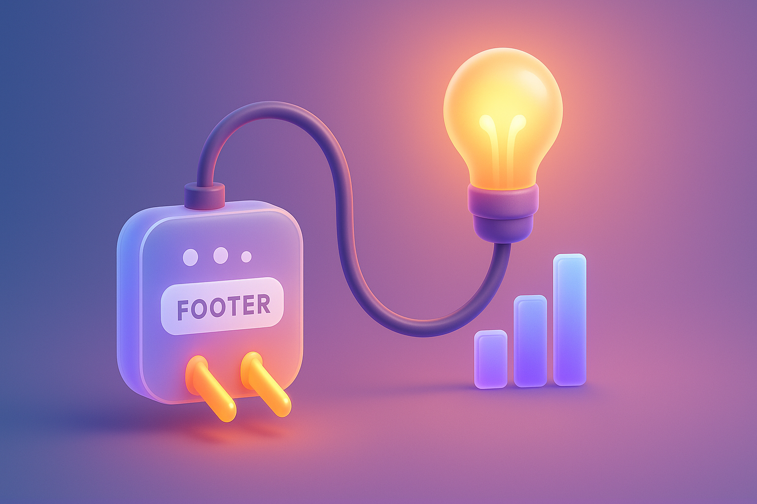
Don't overlook Footer! A collection of Website Footer design techniques that help improve UX, supplement SEO and change the visitors to become the Lead.