
July 20, 2025

Marketing, Sales, or all B2B business owners ... Have you ever felt this way? You dub their marketing with Google Ads, make content on linkedin well. Traffic runs into our elegant website every day, but ... why inbox the sales department "is quiet" like a cemetery? When opening the Google Analytics, they only find high bounce rate numbers, low on pages, low, low, soil. And the most painful is the "Request A Demo" or "Contact US", hardly moving at all.
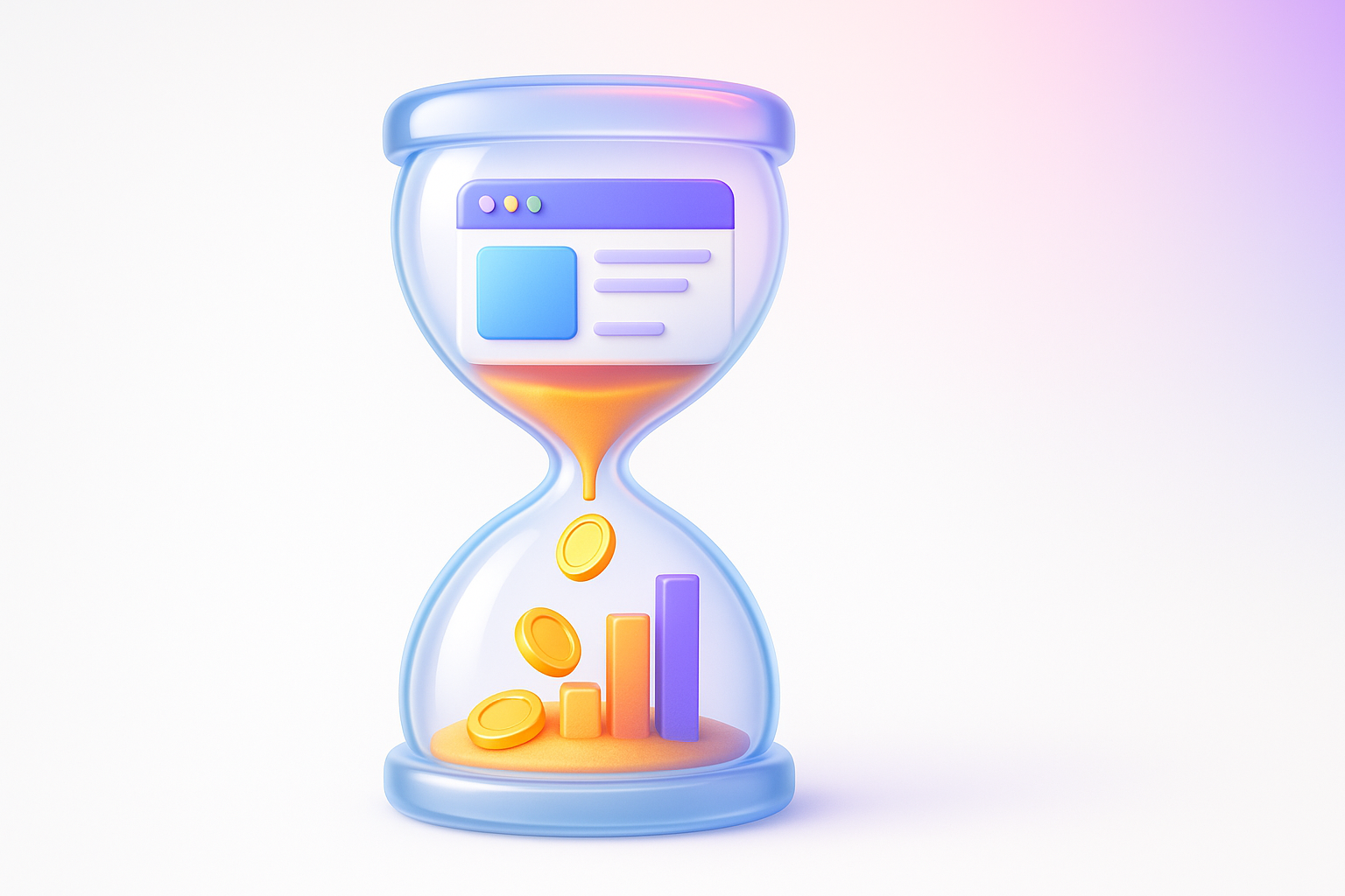
If you are nodding ... you are not alone. This is the "nightmare" of a large number of B2B business that has a "website" like a water tank that leaks. Today we will come to fill the leak with "UX Audit". The secret weapon that will change your website from just "Online brochure" to become a "Lead production machine" that works for you for 24 hours!
Imagine: You just closed the hundred thousand advertising deals to promote the latest software solutions for corporate customers. The marketing team intends to do a good campaign. People click to enter the website enormous. But then ... the silence dominated No telephone from the sales department No email requesting a quotation The thing that has returned is the Report, which points out that most visitors spend less than 15 seconds on the LANDING PAGE page and then pressed to close.
These symptoms are dangerous signs that sue your B2B website. "User experience" or UX (UX) that is poor. It's not just "not beautiful" but it is a business problem that makes you:
These problems are often overlooked. Because we are only focusing on the "beauty" of the design, but forget that in the world B2B, "clarity" and "simplicity" are always more important. Learning the UX/UI design principles for the B2B business is the first step that will help you liberate from this circuit.
[Prompt for illustrations] Compare graphics, 2 sides of the left side of the water tank. There is a sign written "Marketing Budget". Water (Traffic) flows in and leaks out. The face is confused and frustrated. The right side is a water tank that does not leak. There is a beautiful faucet that says "Qualified Leads" and has a satisfactory smile.
Why is the B2B website that looks superficially "Pro" is difficult to use in the eyes of customers? The source of the problem is often from "The Curse of Knowledge" is what is "clear" for us (because we are with our products/services every day), it is a "complicated" and "confused" for outsiders who just met our website for the first time.
The main reason why the UX of the B2B website is often circling with these things:
All of this causes "Friction" in the user Journey Map or the customer's journey They come in with expectations. But found a complicated Until having to give up and finally
[Prompt for illustrations] The cartoon showing the owner of the company is proudly speaking about the XYZ 3.0 feature with complex equations on the board. But the customers who stand listening are confused and have a question mark (?) Flowing his head.
Having a bad UX on the B2B website is not just a small matter that loses Lead for two people a day, but it is a "bad disease" that gradually eats your business in the long run. The consequences are more intense than expected:
Imagine how much you are losing business opportunities to let your website be like this? Slow and bad UX problems But still biting your company's profits and future slowly
[Prompt for illustration] Shocking infographic images Show money (Bank Dollar) is being torn into the trash with a sign that "Wasteted Adpend" and the CAC (Customer Acquitition Cost) rising and the Sales Growth goes down.
The best and most direct solution is to do "UX Audit" or systematic examination of user experiences on the website. It is not a "guess", but the use of checklist that has the principle of chasing the "blind spot" and "opportunities" on your website. So you know what to fix And where will it start?
This is the checklist. The B2B UX Audit that you can use immediately. By referring to the principles of experts like Nielsen Norman Group :
This checklist will allow you to see the overall problem. Like watching Behind the process of making UX Audit of the professional team .
[Prompt for illustrations] Beautiful infographic images. Summary of 5 main checklist (Clarity, Navigation, Content, Lead Gen, Mobile/Speed) with each topic. And there is a tick on the side Looks orderly and easy to understand
The only theory would not see the picture. I would like to lift the true case of "Logistech" (fictional name). The warehouse management company for medium -sized businesses.
The original problem: Logistech website has a traffic from SEO and ADS. But Conversion Rate in pressing the "Request A Demo" is only 0.5%. The sales team complains that but the Lead is not of quality.
Audit process: The team uses checklist to inspect and encounter 3 big problems:
Results after editing:
Just 1 month after adjusting the "Conversion Rate" of pressing demo from 0.5% to 2.5% (an increase of 400%!) And most importantly, Lead has a higher quality. Because they have studied the price information This is the power of stop "guess" and turn to use data from UX Audit.
[Prompt for illustrations] The Before & After page of the website "Logistech" on the side shows a vague Headline and does not have a new clear headline side price and has a distinctive "price" button with a higher conversion rate graph.
Now you want to check your website, right? To make your work easier, systematic and real results. We created "Template UX Audit for B2B" on Google Sheets that you can copy for free!
How to use a simple template in 4 steps:
The use of this template will change your audit from a headache into a fun and challenging game. It is a tool that changes the floating opinion (such as "Our website is confused") to become a tangible action plan like using Heatmap to analyze customer behavior. But in the version that can be done by yourself and does not require complex technical tools
[Prompt for illustrations] Mockup images of Template on Google Sheets that look beautiful and easy to use. See columns such as Checklist Item, Rating, URL, Notes and a small summary graph with a large CTA button written as "Click to get a free template!"
I gathered a popular question about making UX Audit for the B2B website with clear and straightforward answers.
Q1: There is no basic tech or design, can you really do the UX Audit by yourself?
A: Certainly 100%! Checklist and Template are designed for "business people" and "marketers" are not UX Audit's heart programmers. Looking at the website through the eyes of "customers", you don't need to know how the code works. Please just answer that "This menu makes me confused" or "I can't find the quotation button." That's enough.
Q2: How long does it take to do it for the first time?
A: For basic inspections, according to Template, we advise you to divide the time that no one has to disturb about 2-4 hours. Do it comfortably. Don't hurry. The goal is to find a defect. Not to finish as soon as possible The more time you give it to it The more you discover more opportunities
Q3: After completing the Audit, I found what I had to fix. But can't fix it yourself? What to do next?
A: This is good news! You have a list that must be resolved with clear reasons and positions (from our template), giving you the best "brief" to talk to Designer or Agency, and you will not just say that "Please help the website a little better." But you can say that "Helps to change the color of the CTA button on the pricing page to stand out and cure Headline on the first page." It makes employment easier, saving time and directly. Or if you want The UX/UI expert team came to help. It will make the conversation very smooth.
Q4: How often should make UX Audit?
A: At least once a year, but it is best if done every 6 months or every time there is a major change on the website, such as launching new products, a large web structure adjustment. Or when you notice that the amount of conversion begins to agree without knowing the reason for doing Audit regularly is to take care of your business in the long run.
[Prompt for illustration] Image images of people are talking. With the question mark (Q) and a lamp (A) in the middle of the question-answering questions that clear the questions and the exit
The B2B website is not just "home" online, but it is your best "first -hand salesman". It works 24/7, accessing customers around the world. And is the first checkpoint that impresses your target customers Allowing this employee to not work at full efficiency because "difficult to use" is the most disappointing.
The "UX Audit" is one of the most worthwhile investments that you can do today. It is a change from "losing money" with a worthless traffic to "make money" from the traffic that you already have by filling the leak and improving the experience of the customer to the best.
Don't wait for the competitors to overtake you again. Do not let your marketing budget leak in vain. It's time to change your B2B website into a powerful Lead production machine.
Start doing immediately! Download our Template UX Audit and start checking your website health today!
And if you find a problem but not sure how to fix Or need an expert to help upgrade your website to the next level Our team is ready to provide the CONVERSION Rate Optimization and the UX/UI design that truly creates business results . Consult us always!
[Prompt for illustration] Powerful last image Is a picture of a person's hand pressing a large CTA button on the tablet screen The button wrote "Start My UX Audit" on the background is a sales graph and a beautiful GAD growing. Conveys the action and the result will follow.
Before adjusting the UX, people enter the website and then get out. But when removing the new design Become the best off the sale point instead!

After re -the brand with Vision x Brain, sales x3 in 2 months!

Change the web with VISION X Brain for just a few days. New customers start to understand our business immediately.

After the Reemine and Vision X Brain, organizational customers start to book through the website themselves - do not rely on connections like before.

After changing the website with Vision x Brain, the user dares to test the system from the first page - no need to follow the call or explain again.


Compare shocks, shock between Webflow and Framer for Startup that emphasizes the opening speed, beauty and scale ability.
Web speed is not just technical! In -depth that Core Web Vitals (LCP, Inp, CLS) affects SEO ranking, user experience And how the profit of the organization web
Don't overlook Footer! A collection of Website Footer design techniques that help improve UX, supplement SEO and change the visitors to become the Lead.